Plentiful Pastures
BRANDING ( VISUAL IDENTITY, VISUAL SYSTEM, BRAND GUIDELINES, ART DIRECTION )
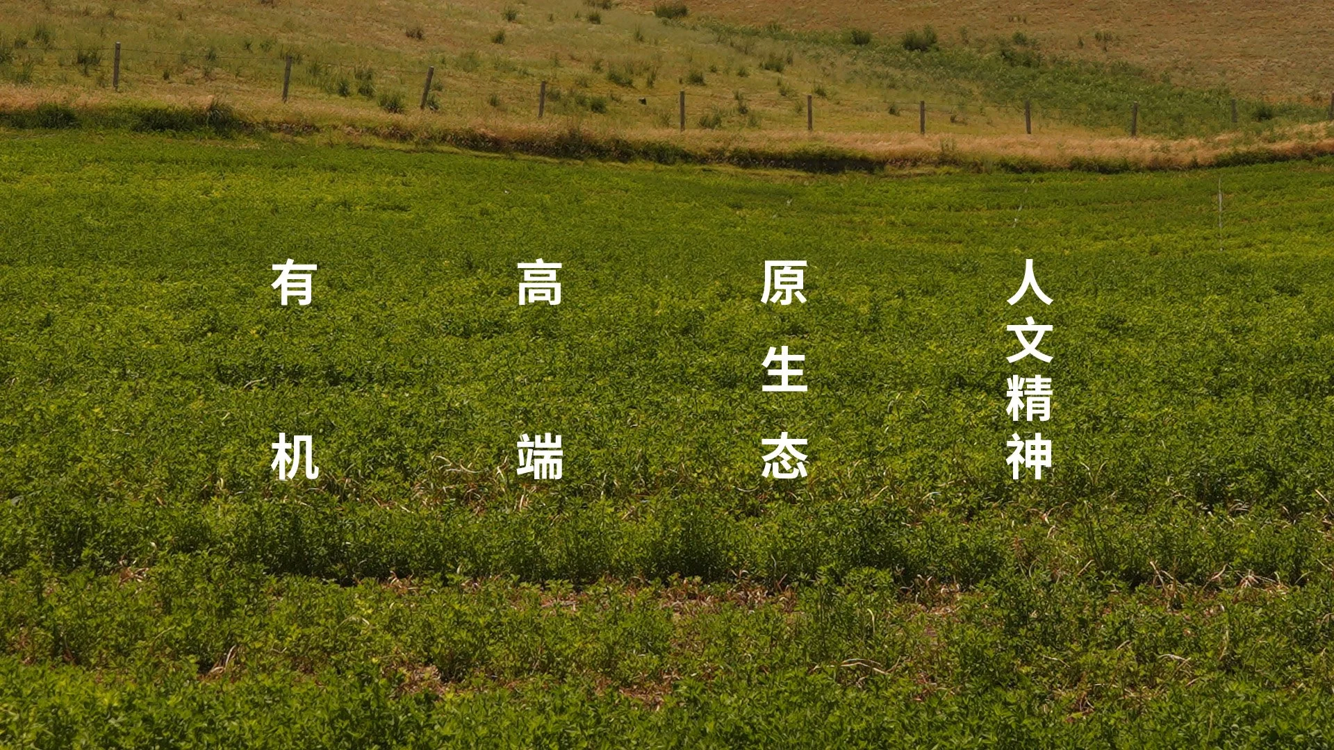
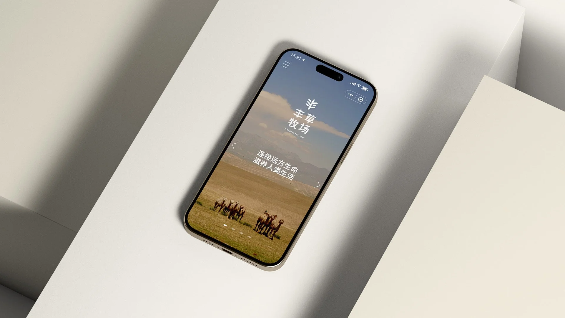
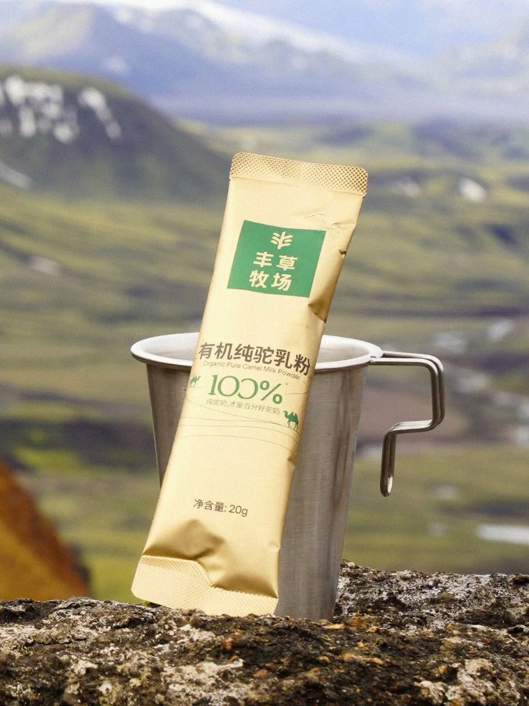
Plentiful Pastures 丰草牧场 is an organic camel milk brand from Xinjiang. Rooted in a single blade of grass, the brand controls the full chain—growing pasture, raising camels, producing, and marketing—turning natural resources into unique strengths. With strict ecological management and free-range herding, camel milk is collected with zero intervention. Through innovative freshness-locking techniques, Plentiful Pastures delivers pure nourishment, especially tailored for the new silver-haired generation. Not every glass of camel milk begins with grass.
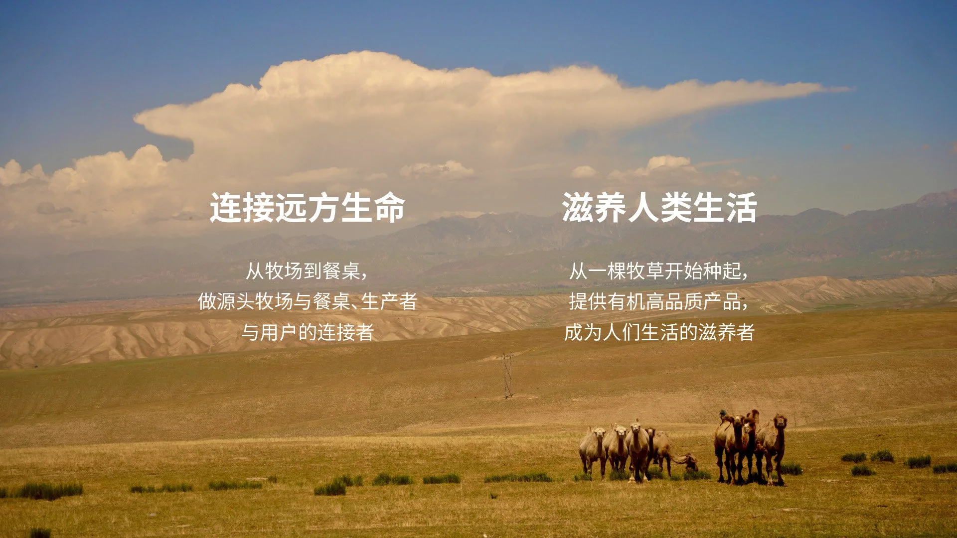
The name Plentiful Pastures comes from the Book of Songs line: “Heavy morning dew rests upon the plentiful grass,” symbolising abundance and vitality. From this foundation, the brand mission is born: to connect distant life and nourish human living.
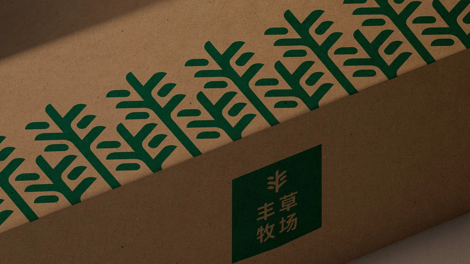
The brand identity translates this into visual form: pastures and dewdrops combine to express respect for nature and humanity, while also shaping the Chinese character “丰.” The logotype echoes the upward growth of grass, with slightly lifted strokes and softened rounded ends—conveying vitality, sustainability, and warmth.
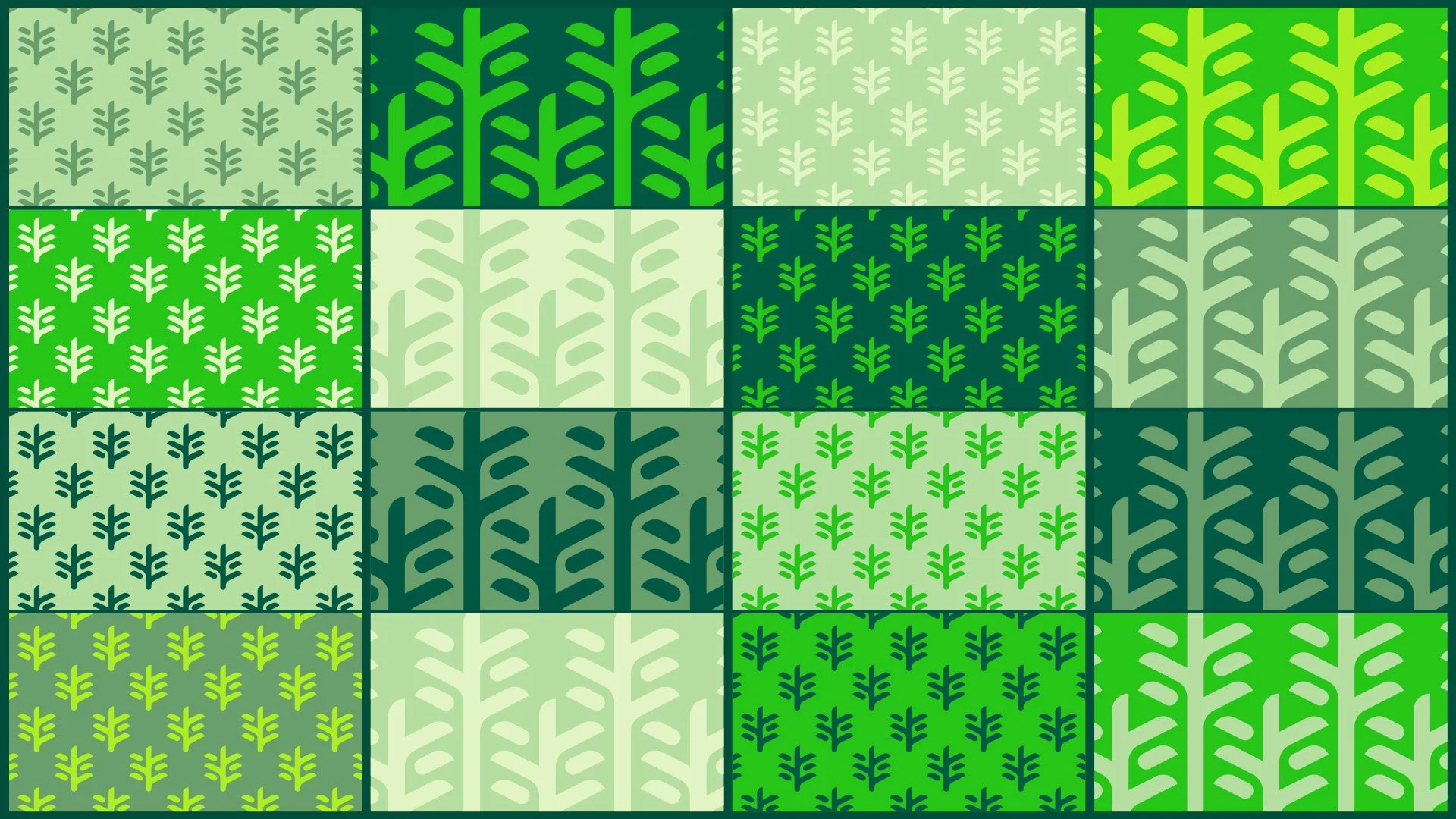
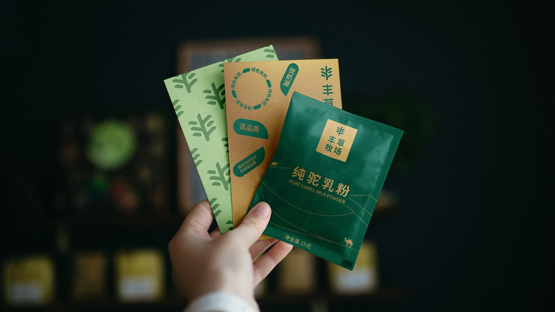
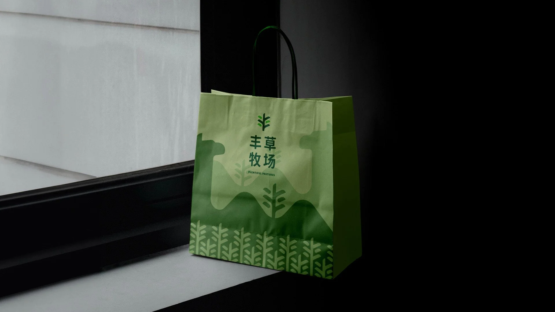
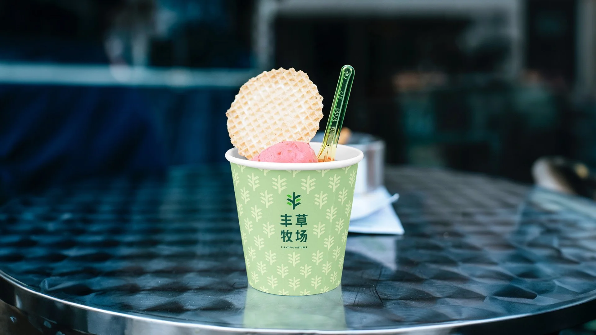
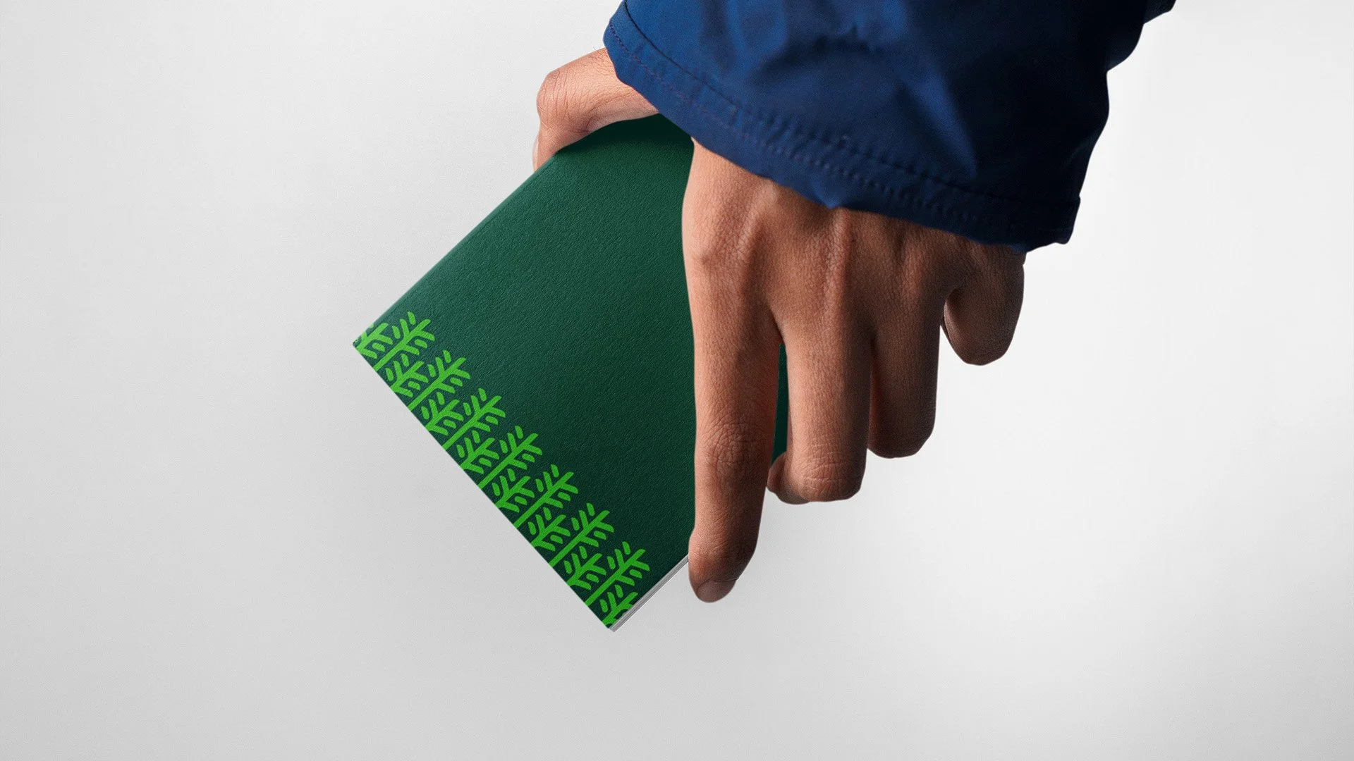
Supporting graphics extend the story. Dewdrop graphics represent care and human connection, appearing as forms of dialogue, advice, and affection. Grass graphics convey vitality and organic abundance, used in repeated patterns to create the immersive sense of a pasture.
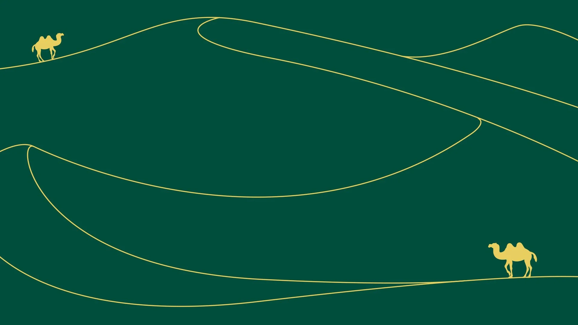
Illustrations follow two styles: geometric color blocks for a friendly, approachable feel (applied to pop-ups, gifts, and ice cream products), and fine linework for a premium tone (applied to high-end camel milk powder packaging).


