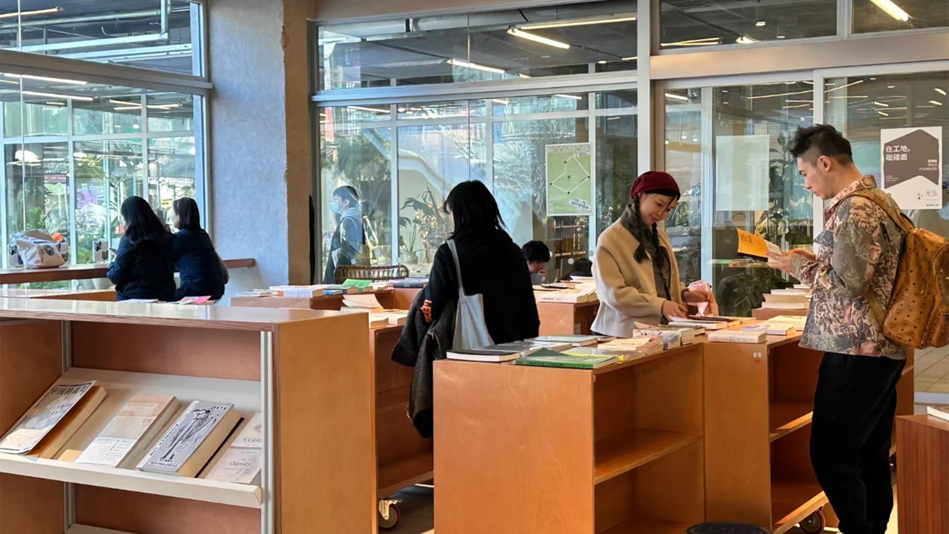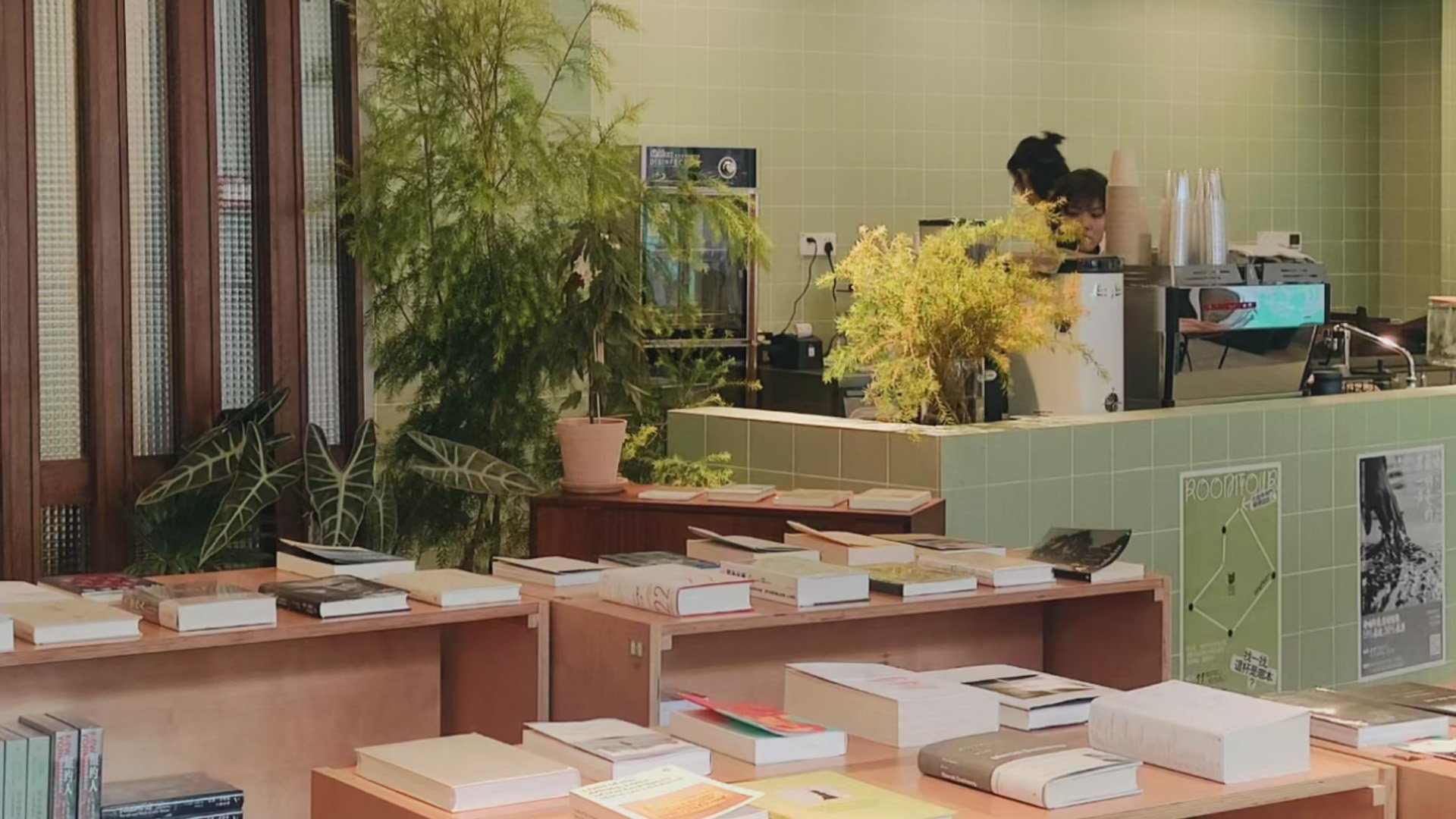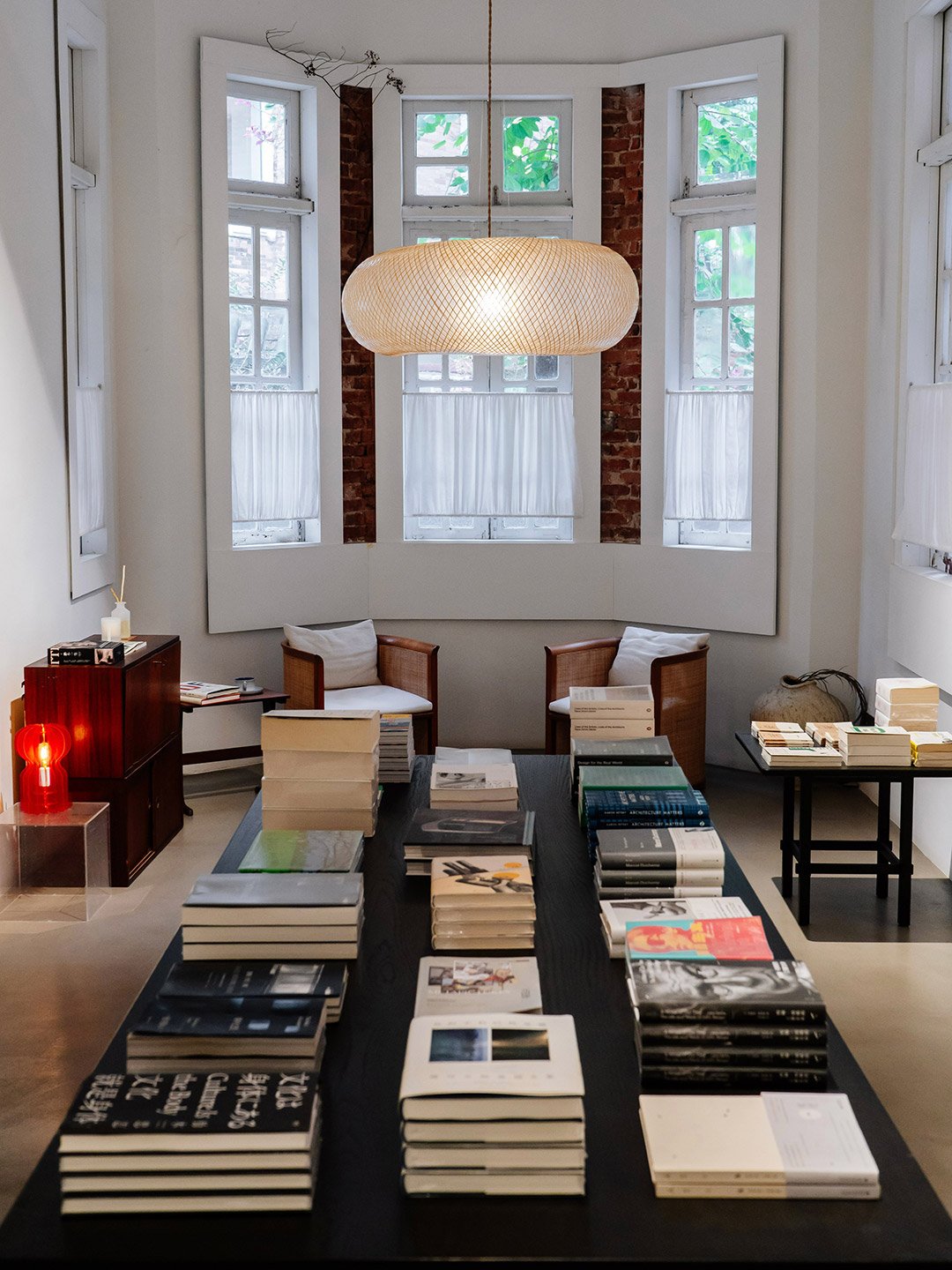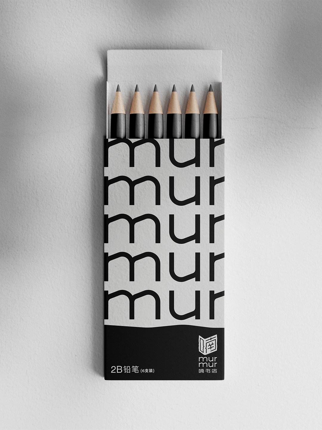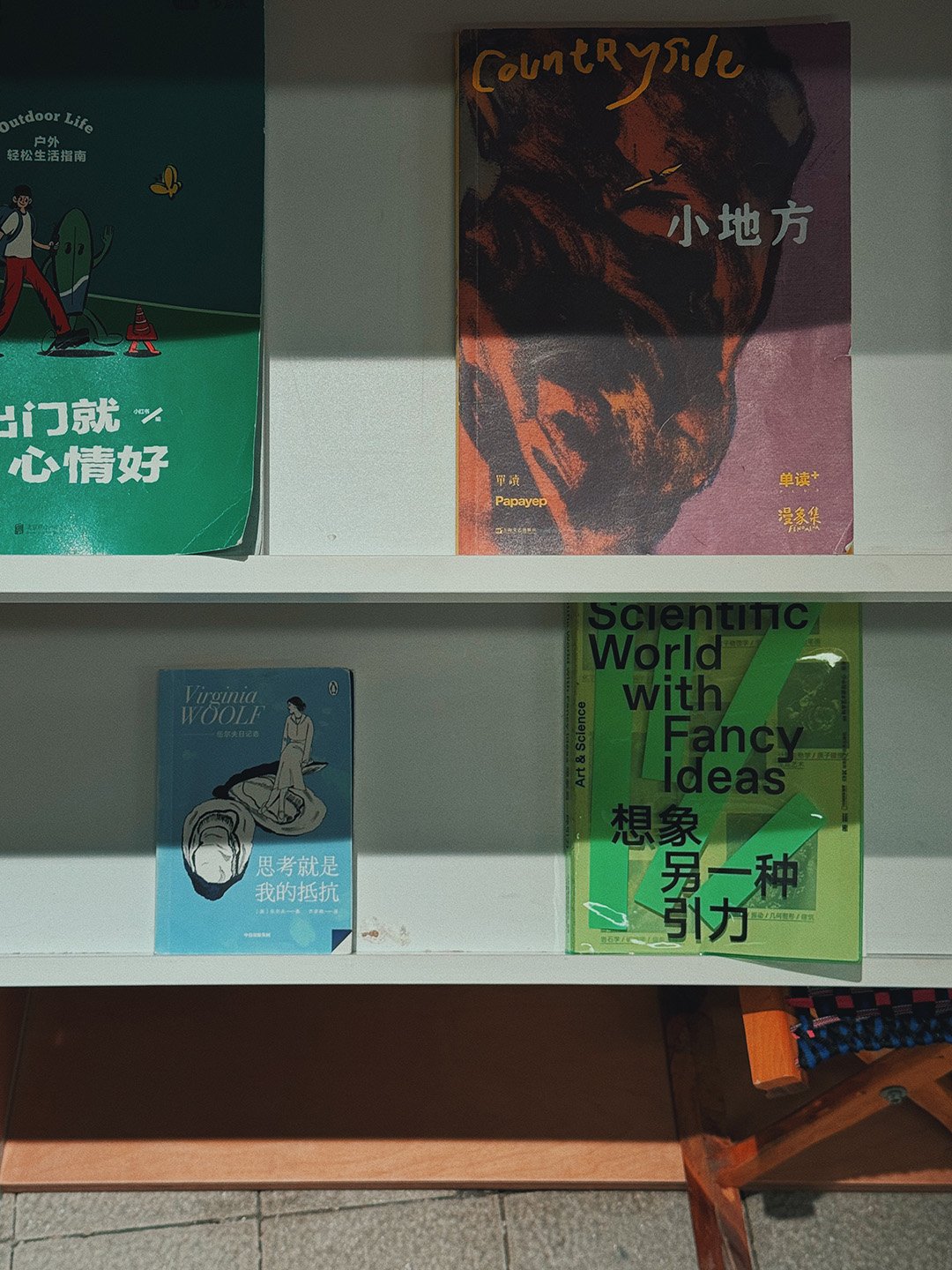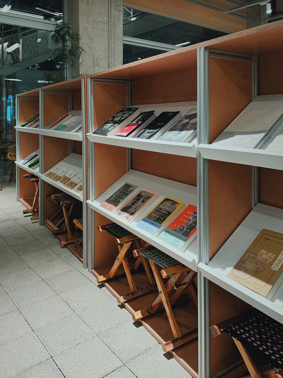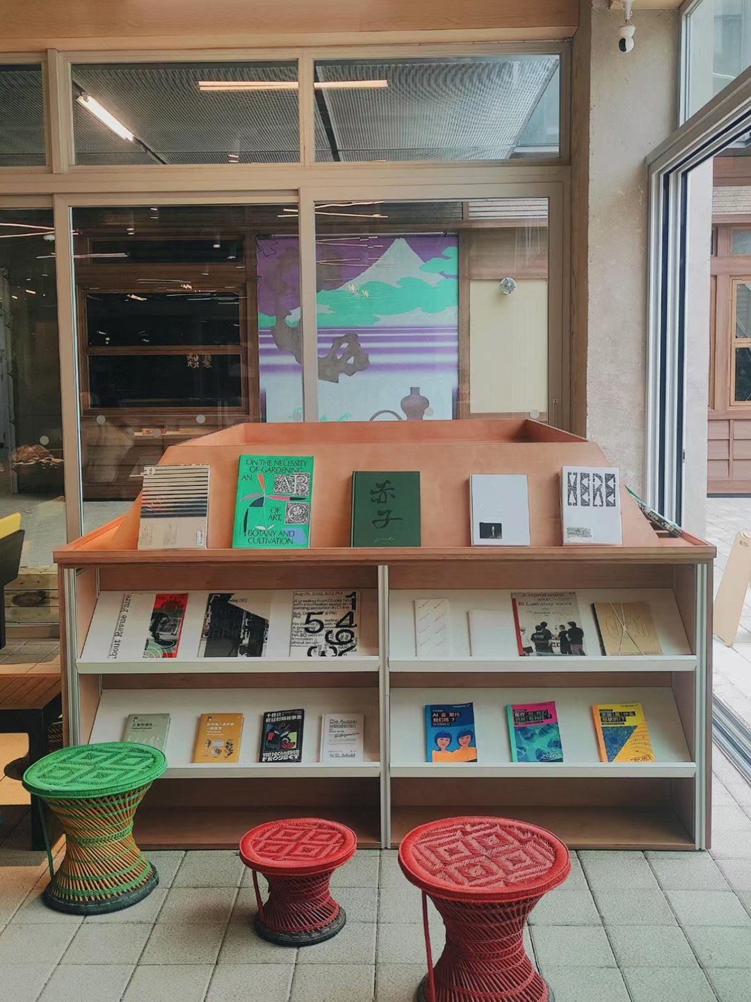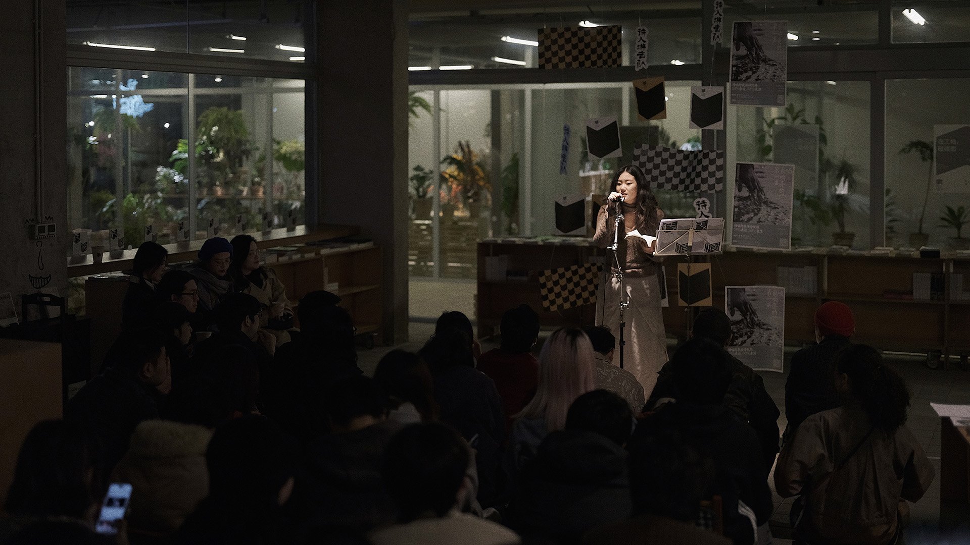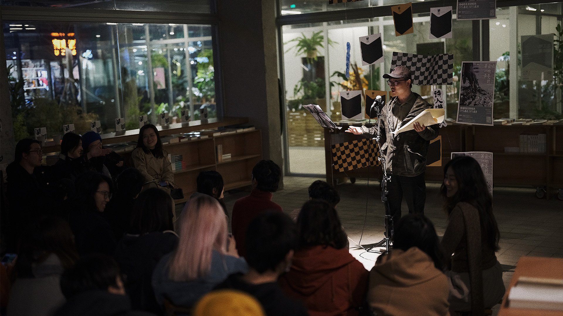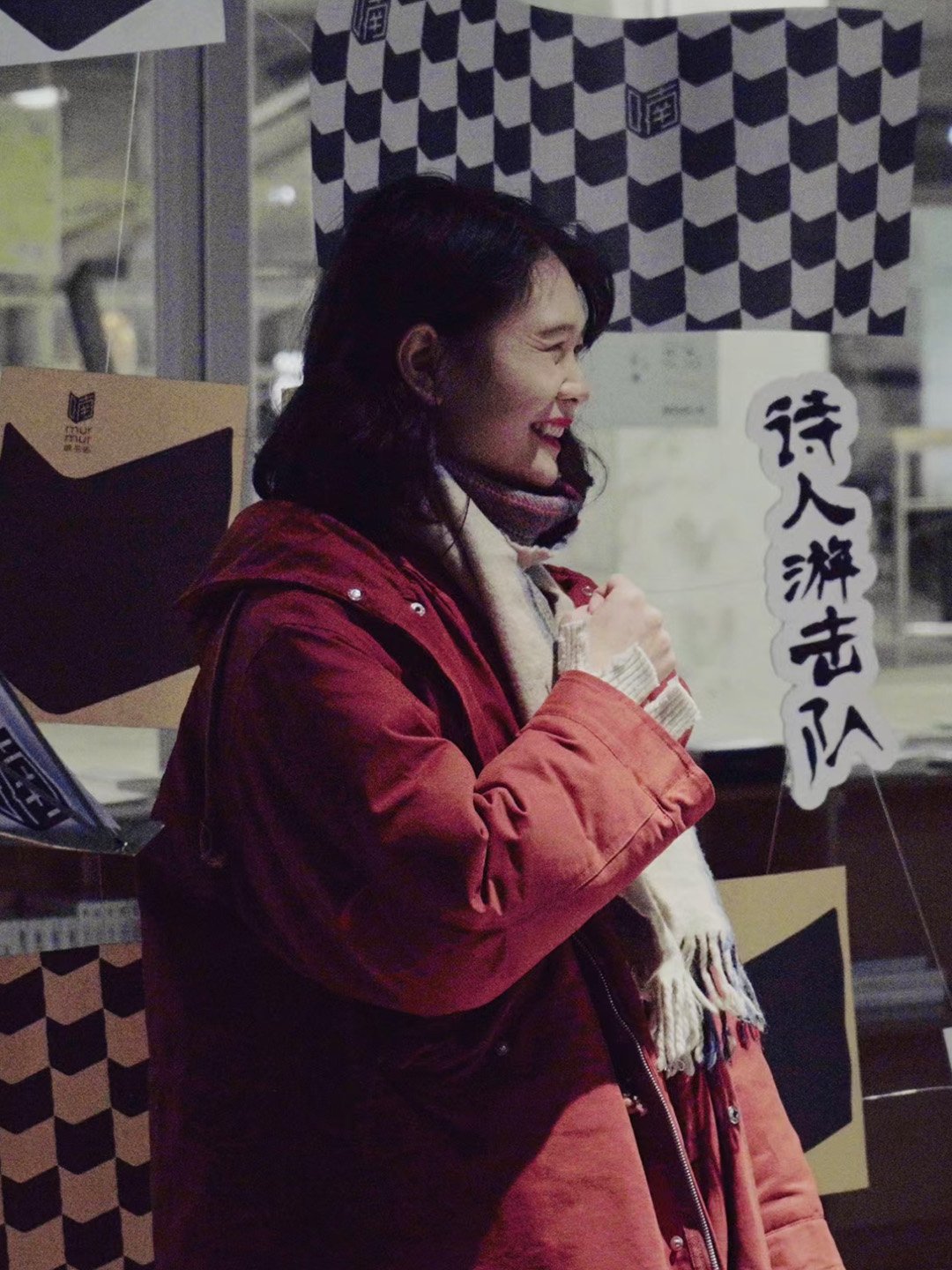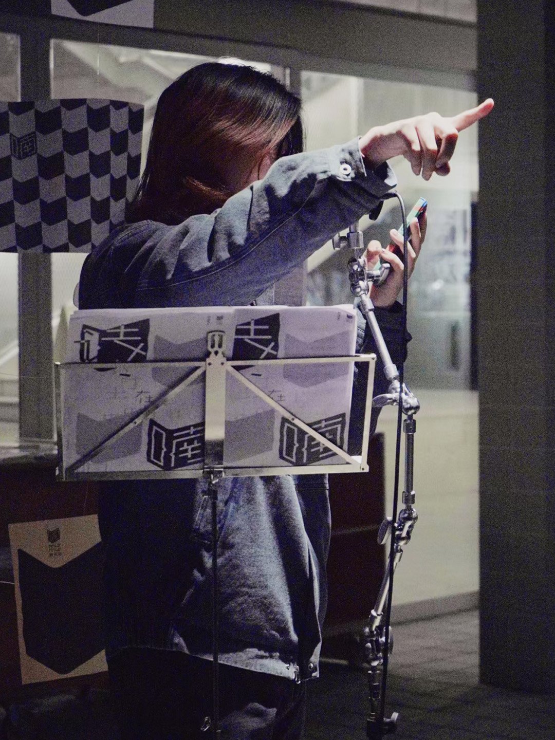
murmur bookstore
BRANDING ( VISUAL IDENTITY, VISUAL SYSTEM, BRAND GUIDELINES, ART DIRECTION )
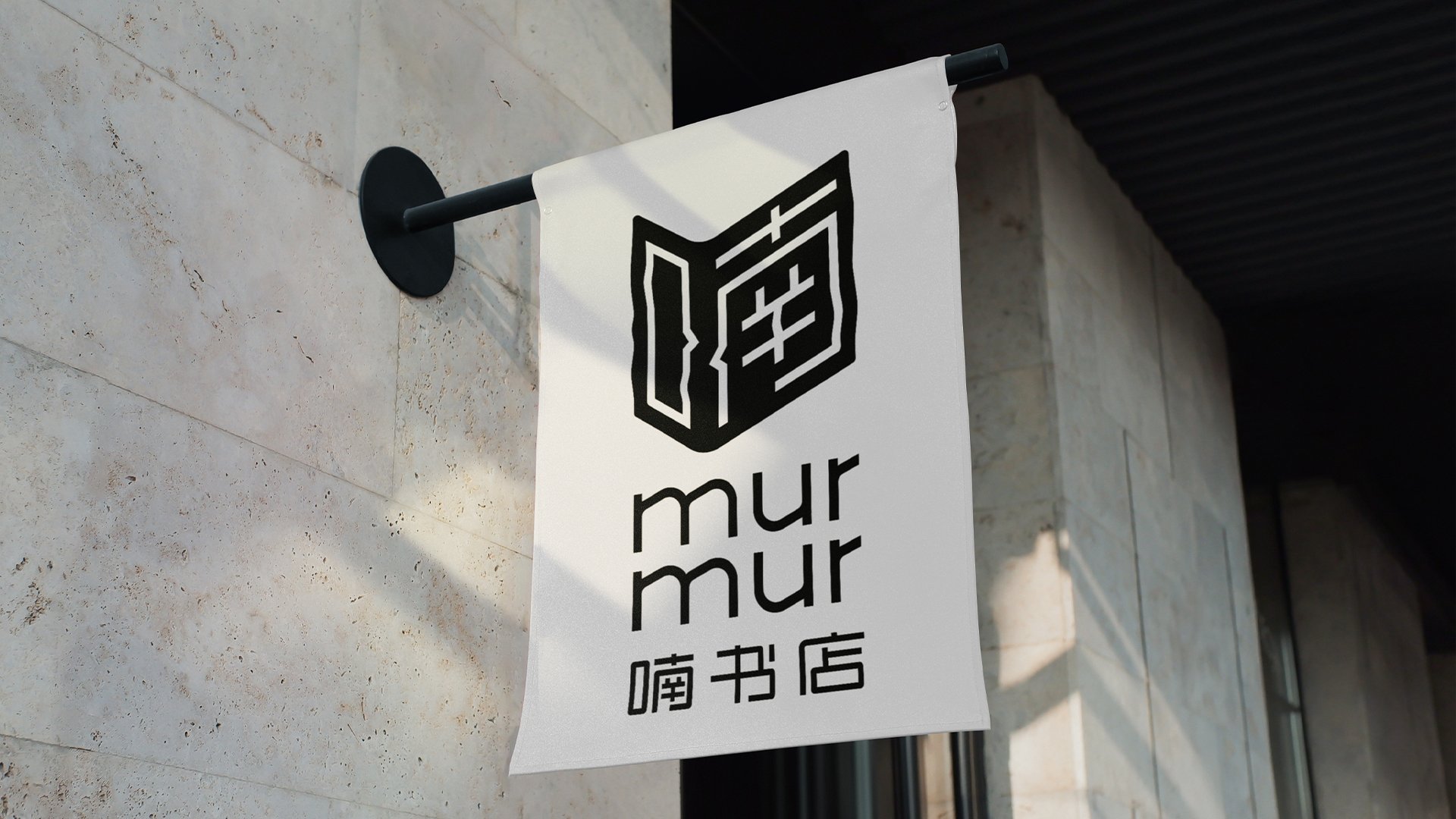
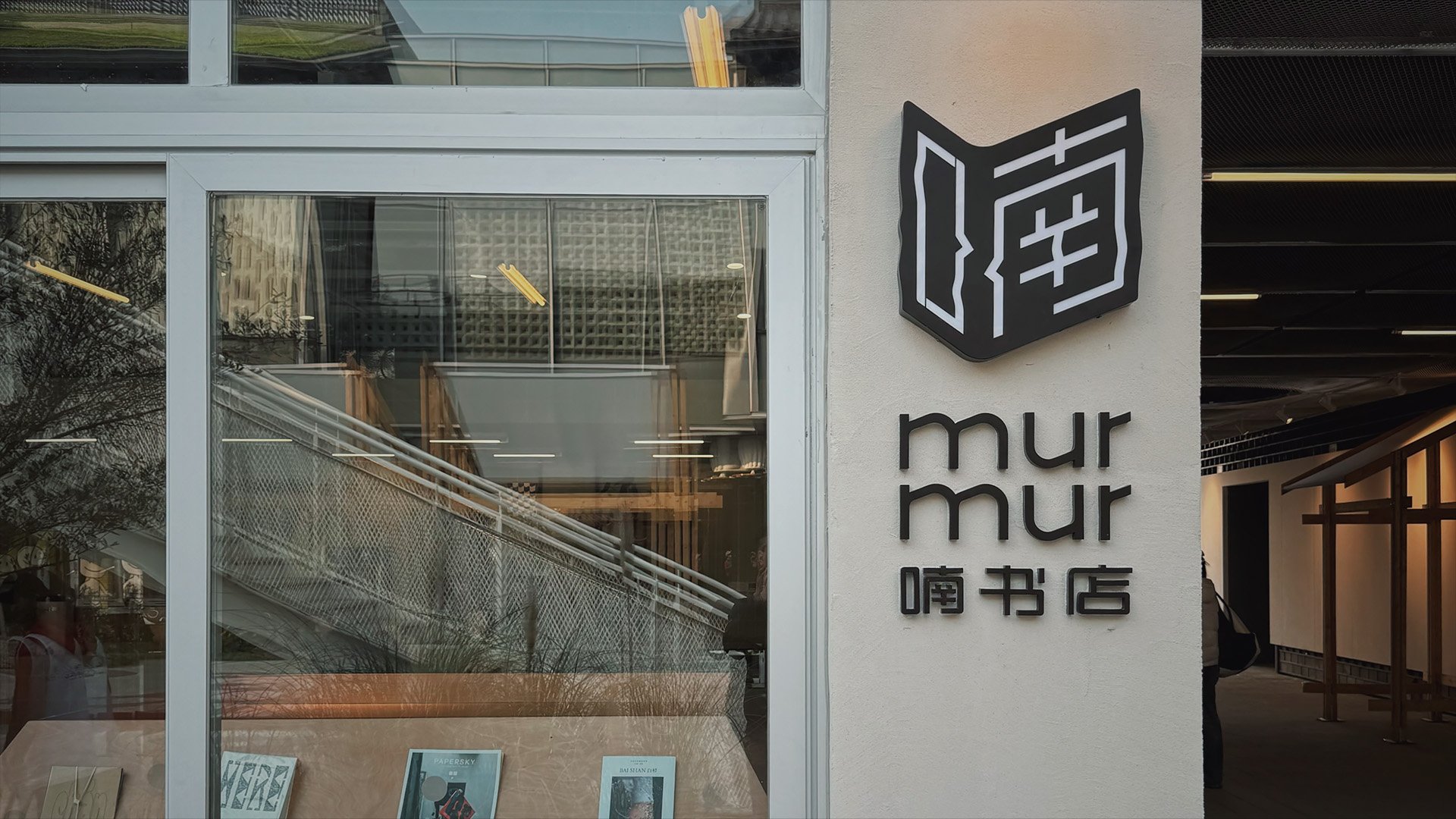
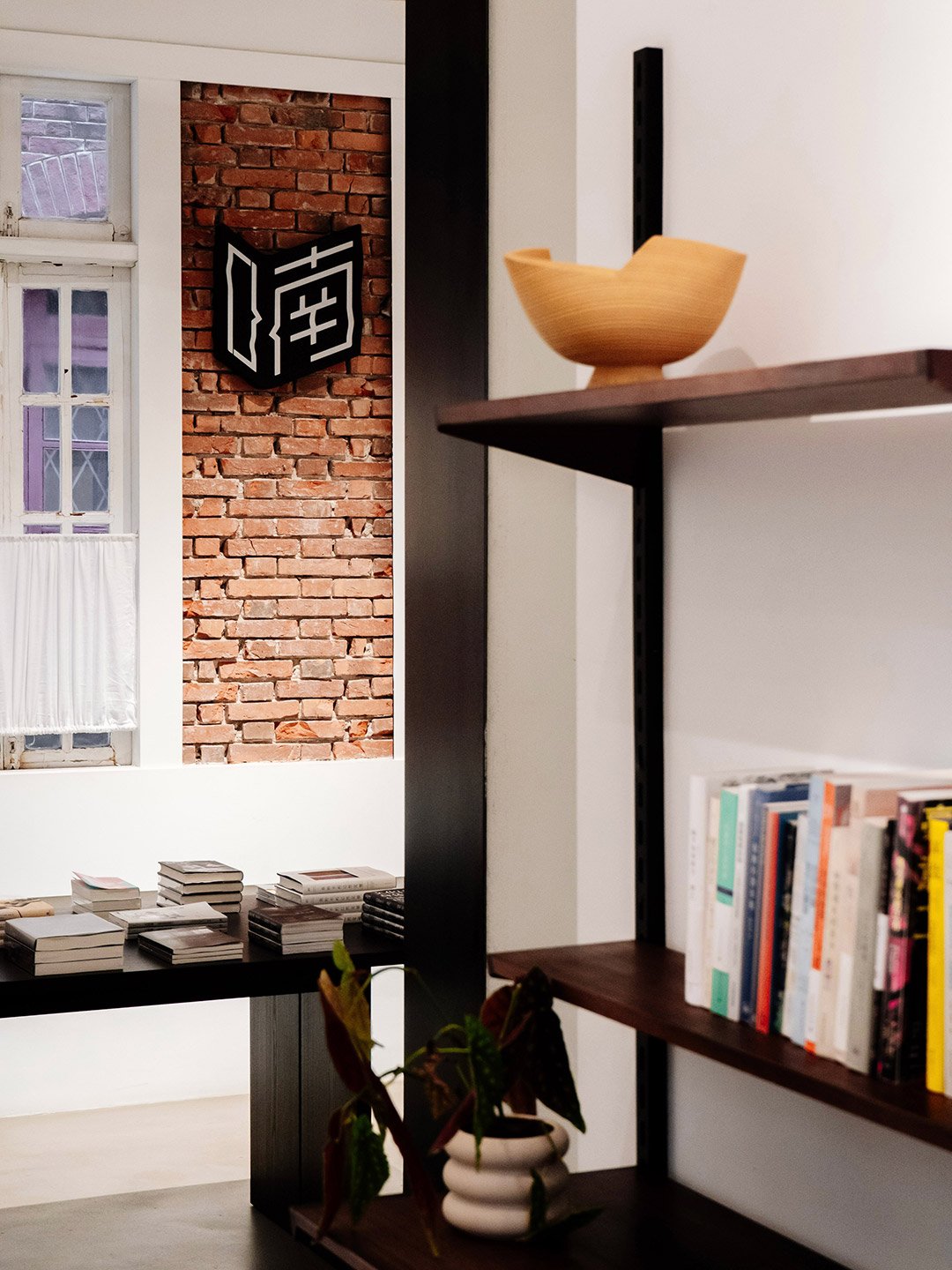
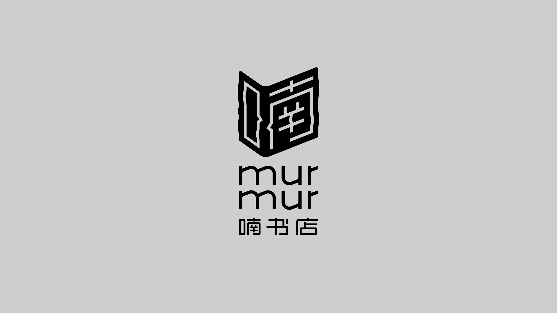
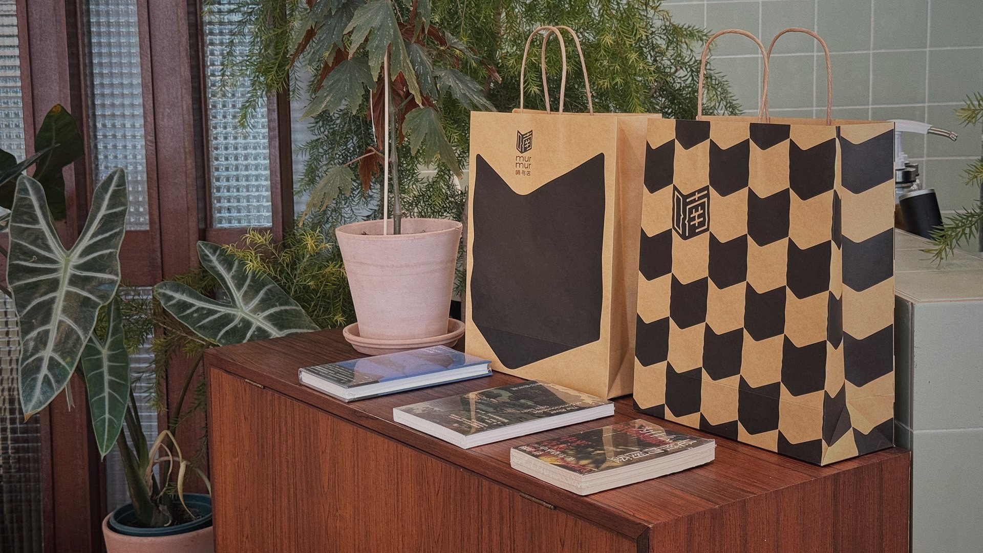
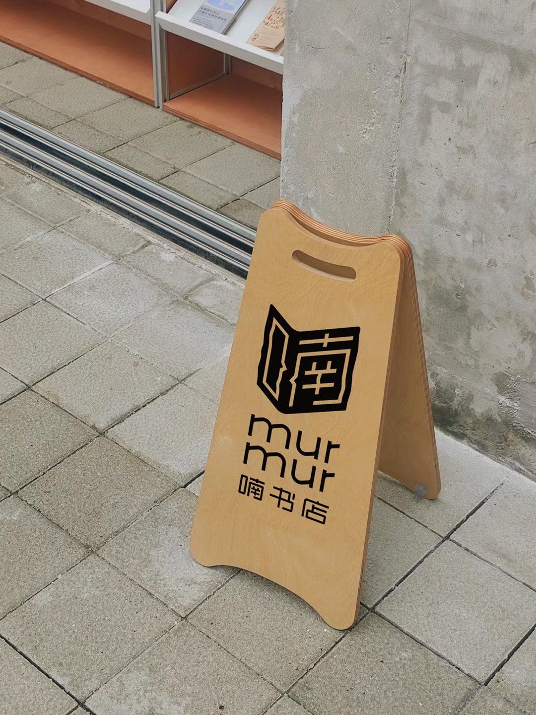
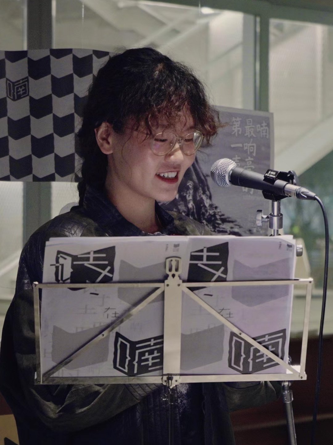
The Chinese Character ‘喃’ ‘Nan(murmur)‘ - one half is '口’ ‘mouth, another half is ‘南' ‘south’.
‘南’ 'Nan' refers to the southern direction of China.
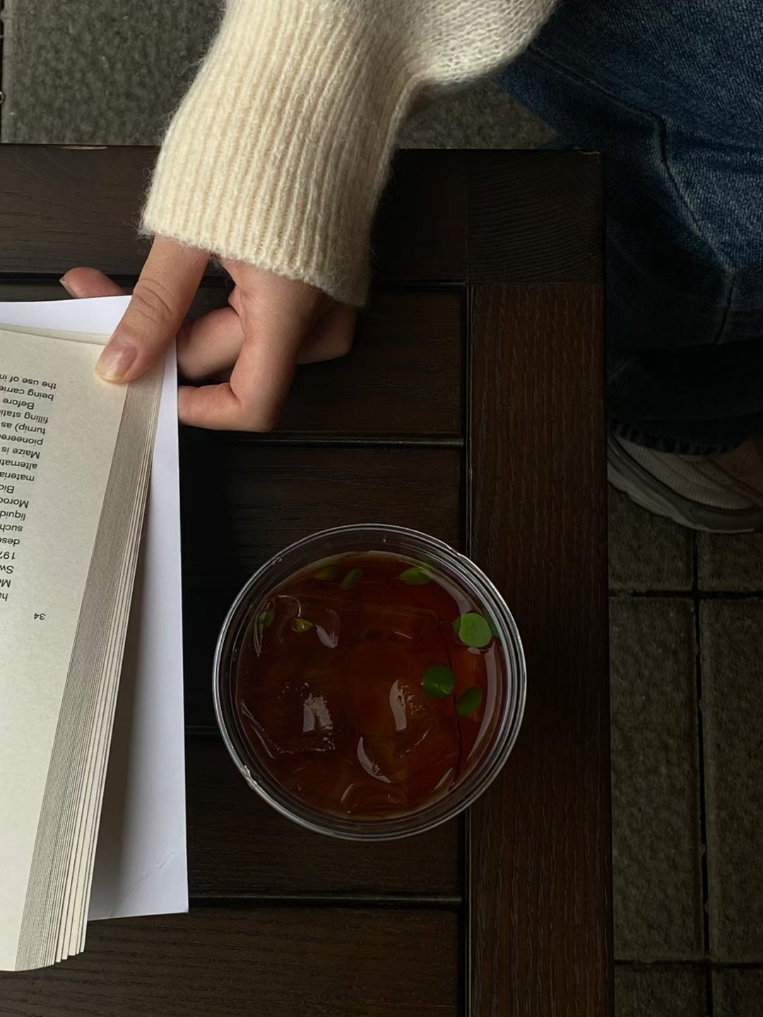
‘口’'Mouth' signifies the murmurs of self-talk when a person enters the bookstore – a whispering state between oneself, the space, and the book one picks up.
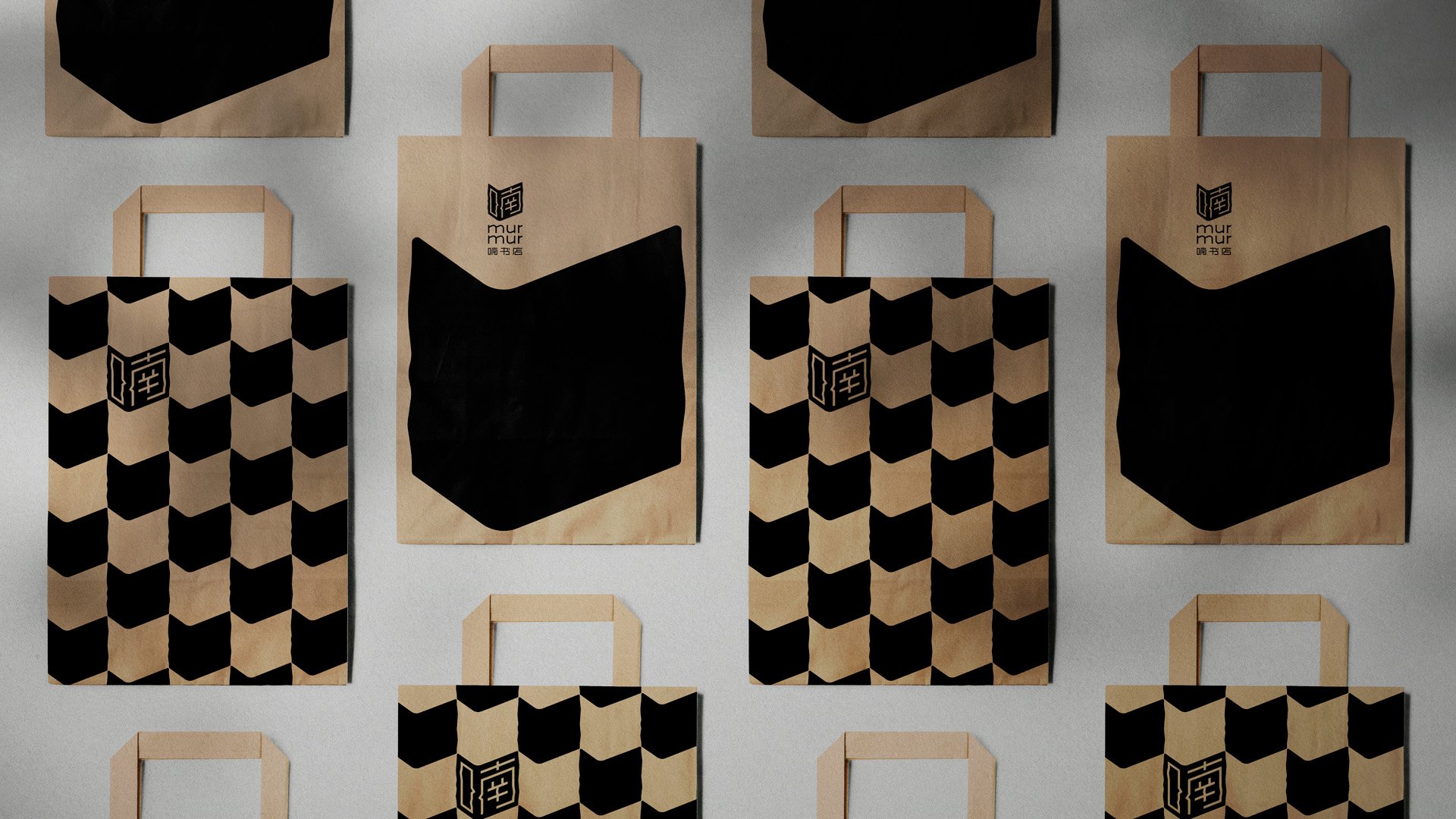
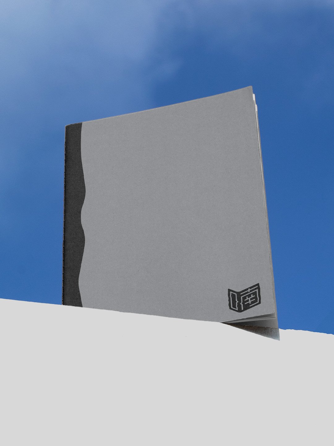
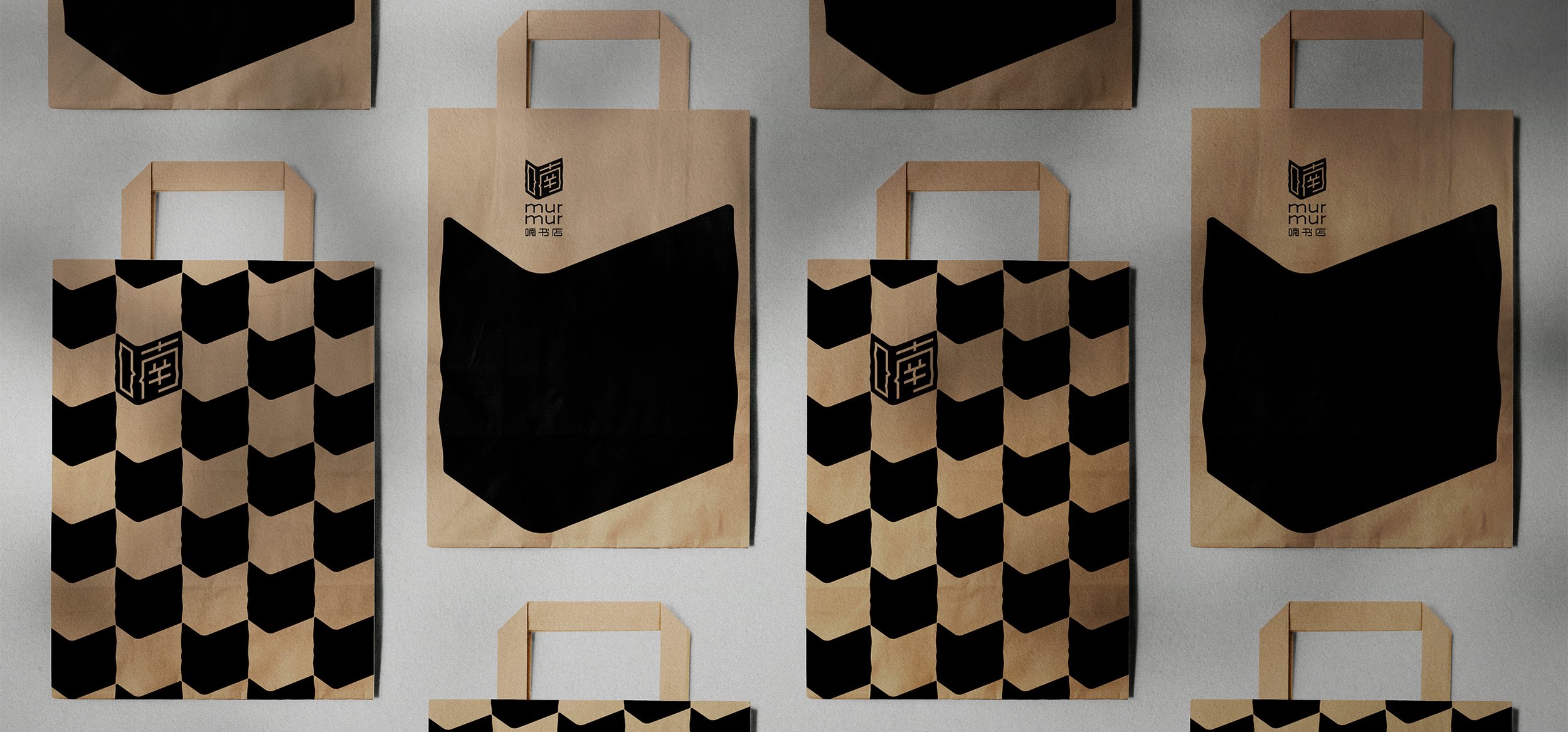
The design of the brand identity is derived from the concepts implicit in the naming of the brand. The design embodies a sense of space, creating a corner of contemplation. The Chinese character '喃' (Nan) is designed in the form of a pair of dialogue boxes. It represents the state of readers whispering and contemplating in their personal space while reading.
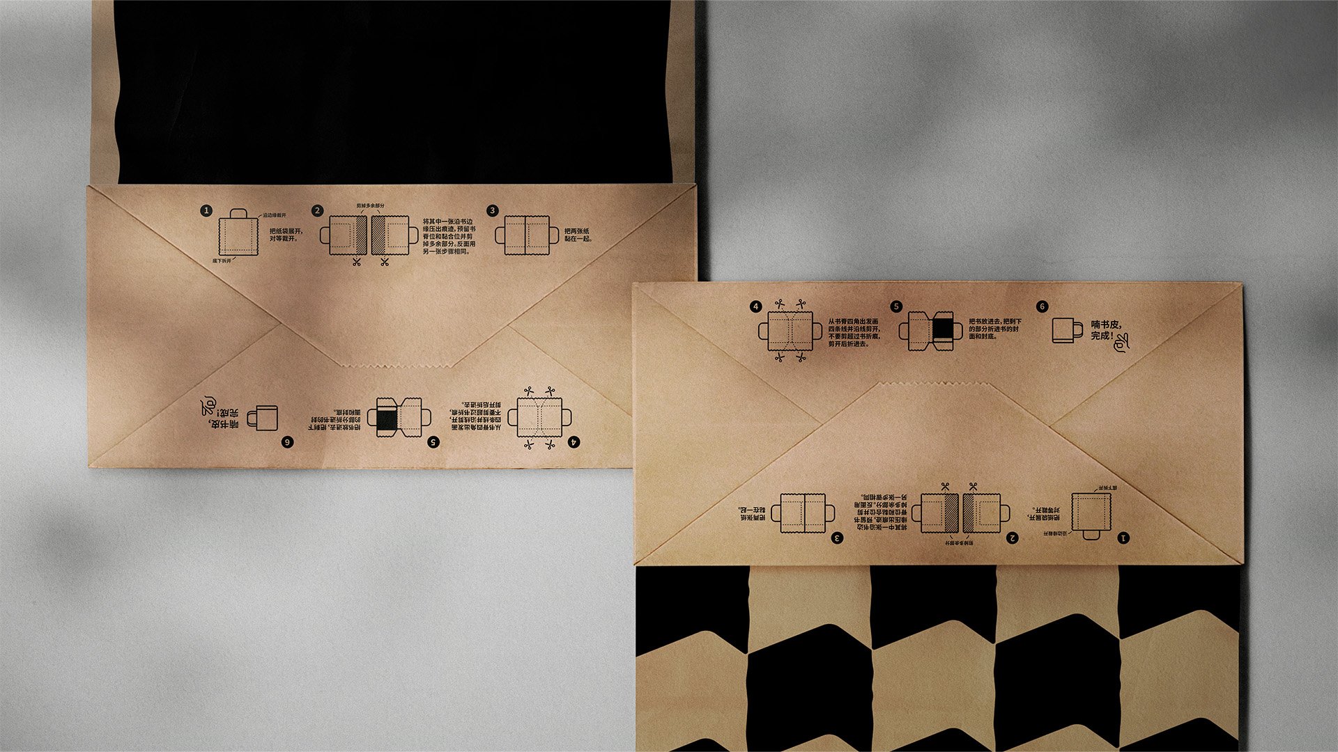
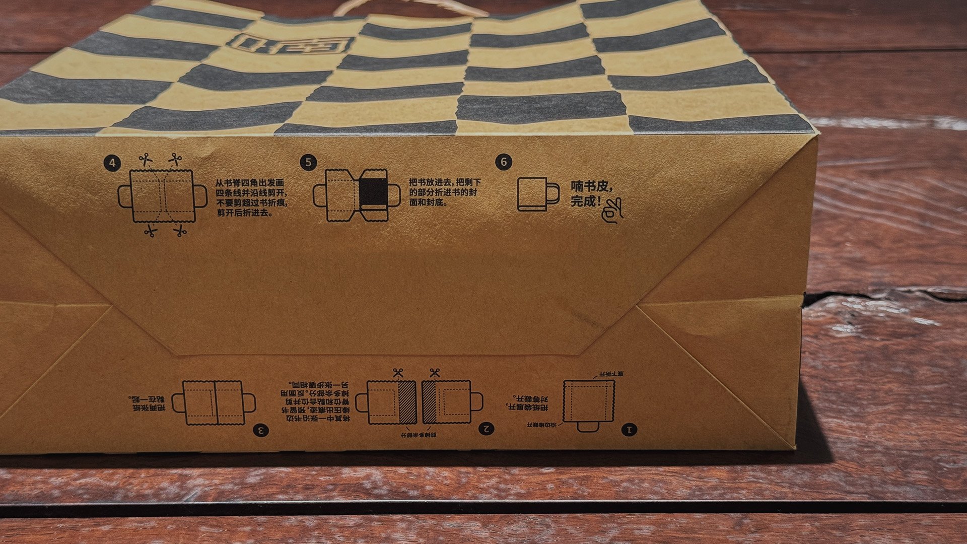
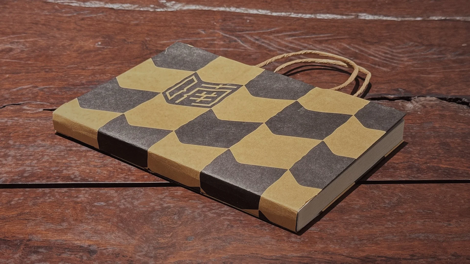
In addition to creating a sense of space and the conversational state of murmuring, the design also conveys the feeling of the book cover turning. It reinforces the bookstore's attributes in appearance. In three dimensions, it is a mental space, a state of conversational contemplation, and the form of books. In two dimensions, it is a southward arrow, indicating roaming bookstore journeying through the southern part of China, from Shanghai to Guangzhou, and to more location possibilities.
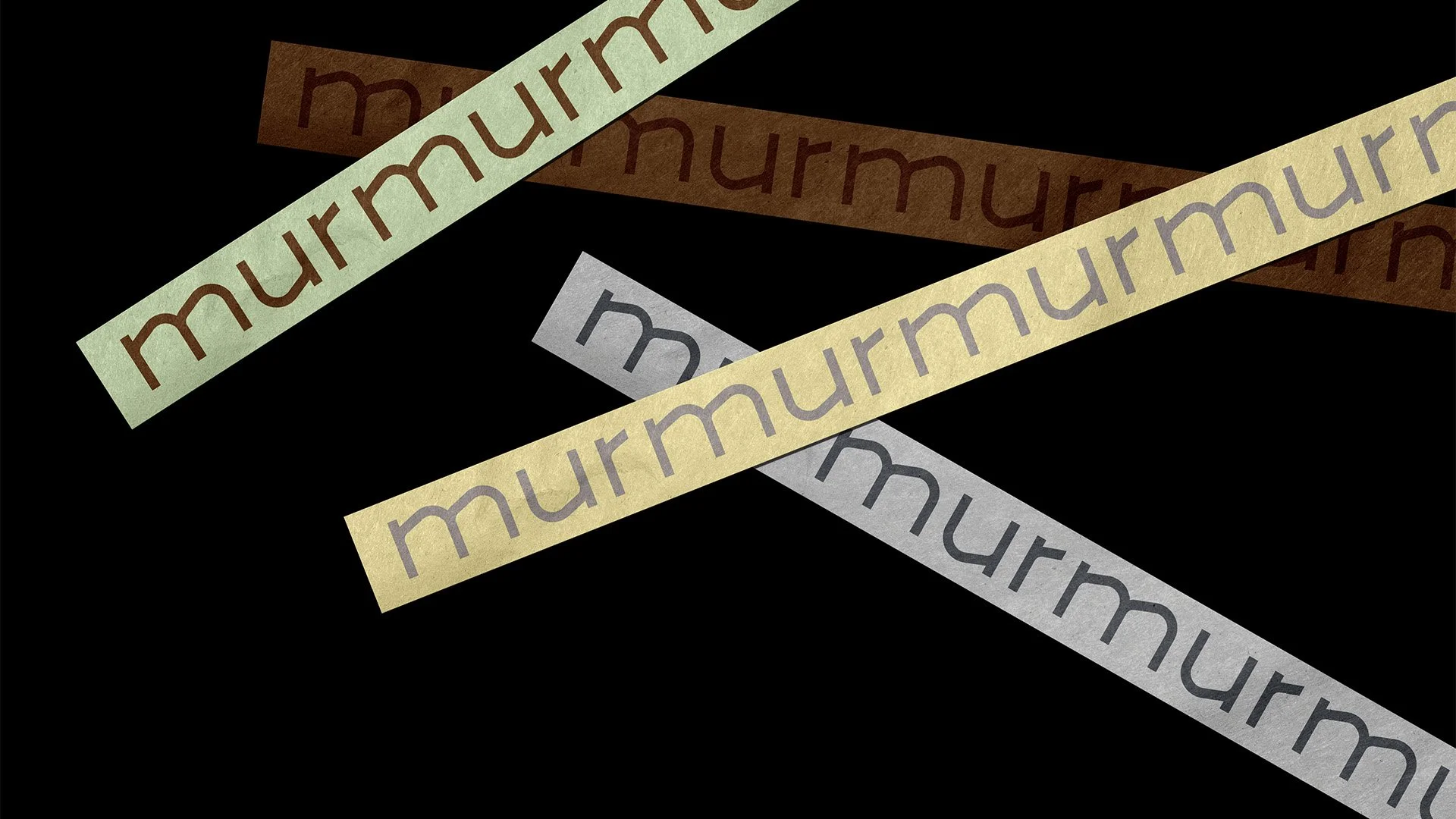
The font adopts a sans-serif design to reflect a sense of delicacy while breaking the straight form of vertical lines in certain areas. Together with the rough vertical lines of the logo shape, It creates a natural state of paper damage and wrinkles, providing a sense of familiarity, artistic identity, belonging, and fault-tolerance for the young audience.
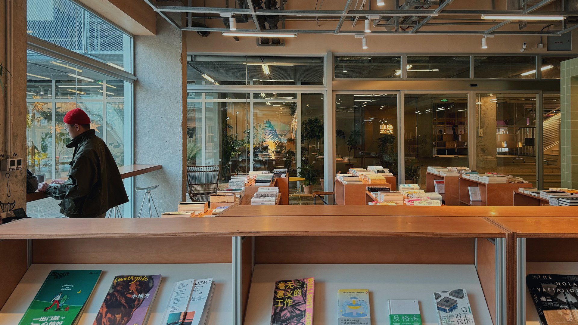
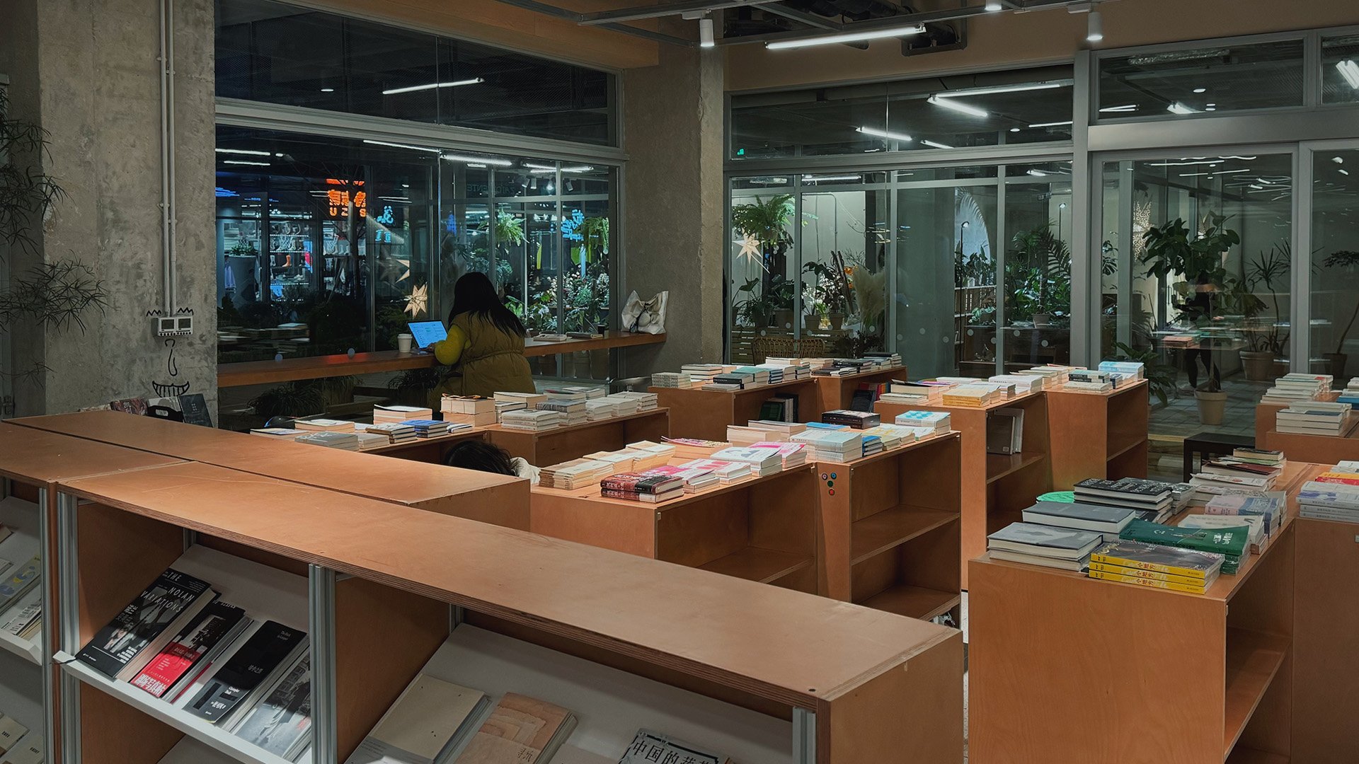
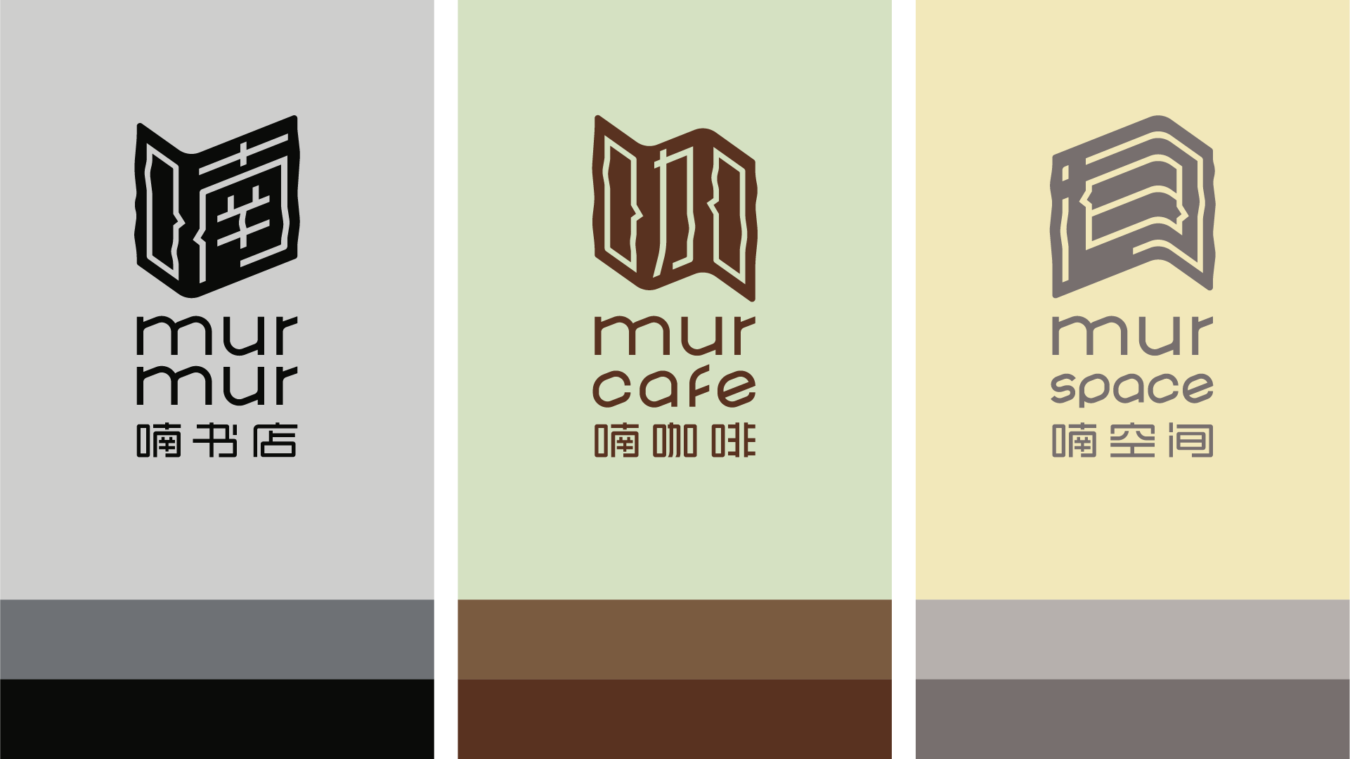
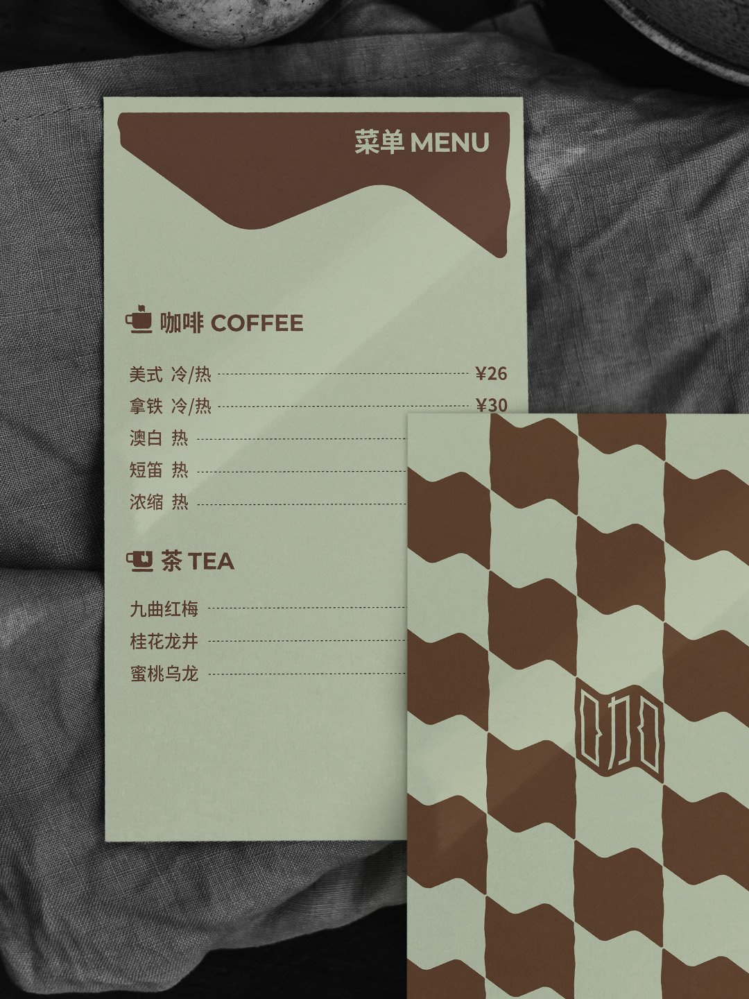
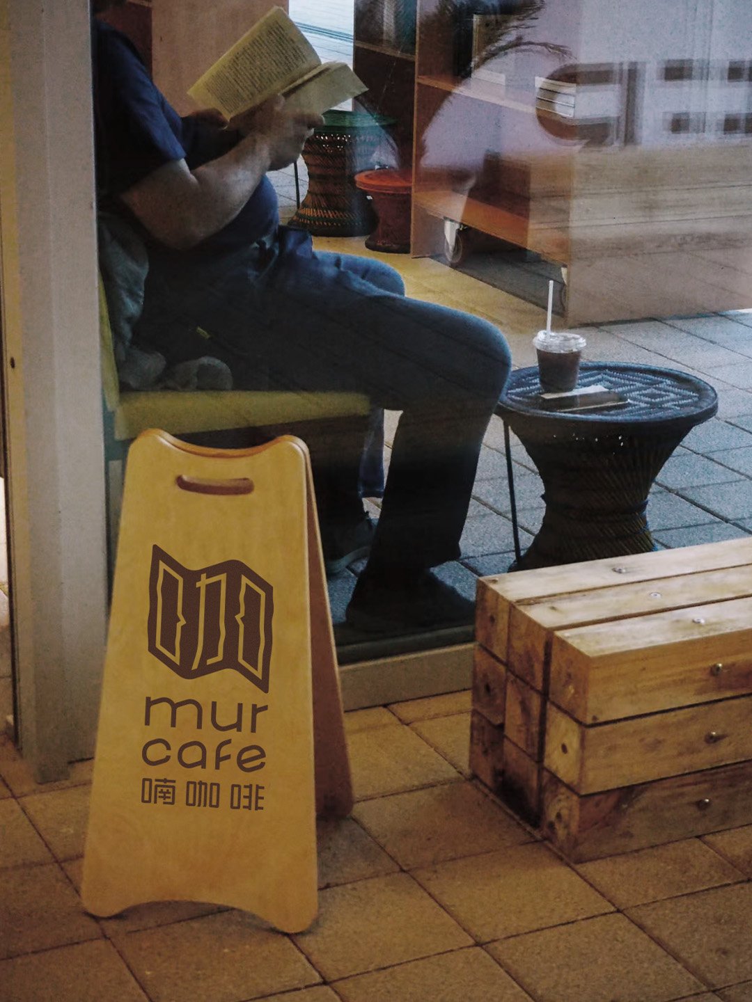
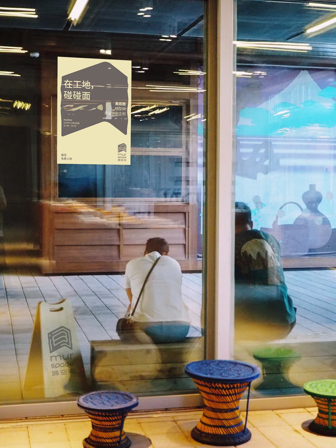
The entire bookstore identities and graphics constitute a design system, with the main reading corner being murmur bookstore, extending to the leisure corner as mur cafe, and further extending to the art corner as mur space.