CJOY Toothpaste
BRANDING ( VISUAL IDENTITY, VISUAL SYSTEM, BRAND GUIDELINES,, ART DIRECTION )
PACKAGING ( PRODUCT PACKAGING DESIGN )
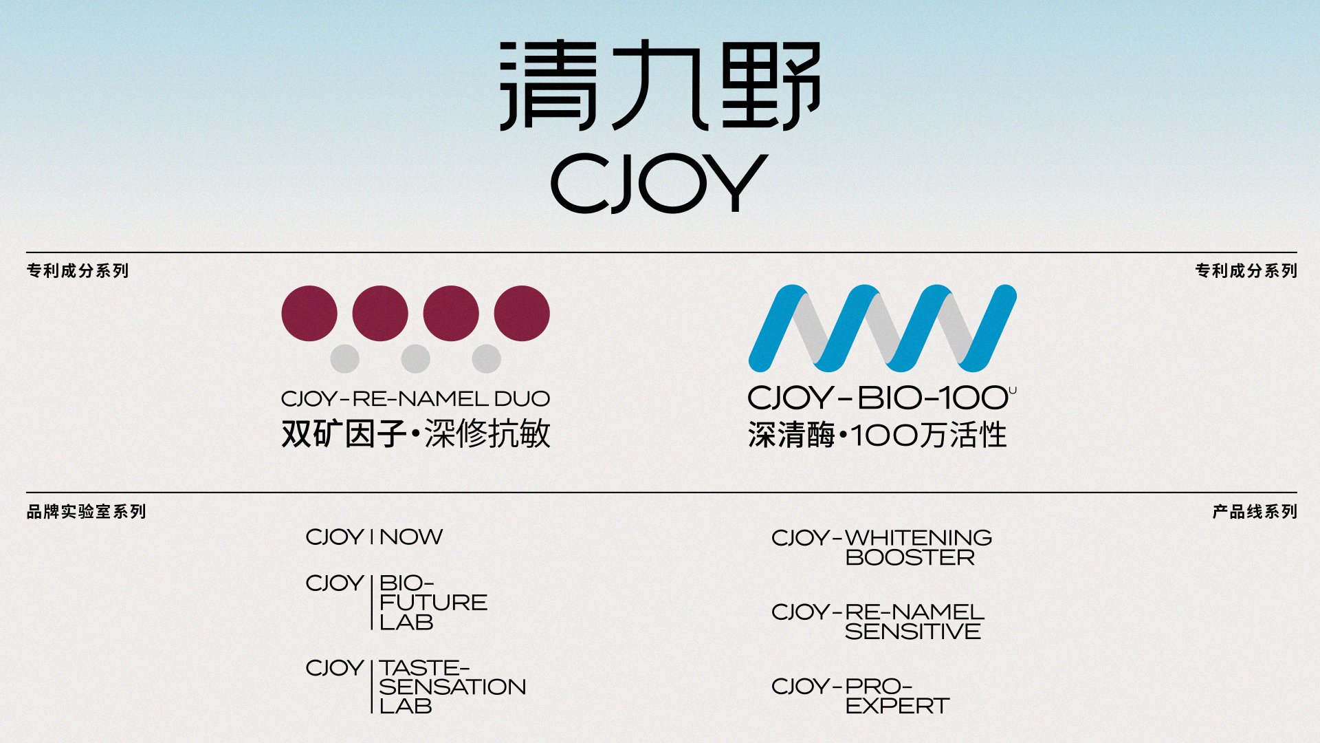
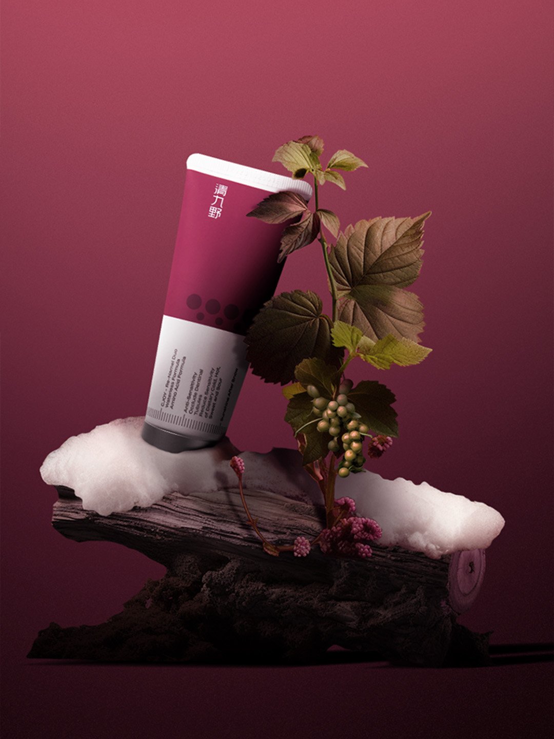
清九野 CJOY (“Qing Jiu Ye”) is a new-generation oral care technology brand. Guided by the philosophy of “Science with Humanity”—balancing rationality with sensibility—the brand combines rigorous logic and cutting-edge oral biotechnology with a gentle, creative touch. The result is not only advanced protection but also a refreshing, joyful experience that transforms everyday oral care into moments of relaxation and delight.
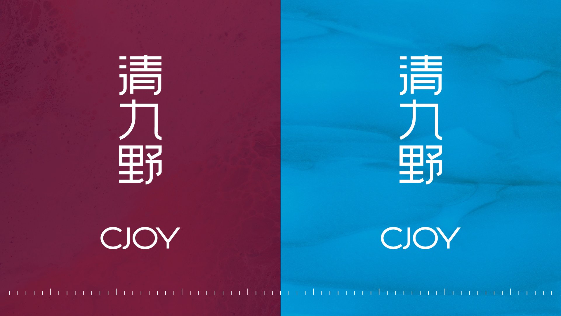
The name carries layered meaning: “清 / Qing” signifies freshness, reflecting the brand’s focus on advanced oral care science. “九野 / Jiuye,” drawn from the Classic of Mountains and Seas (山海经), represents the vastness of the sky, conveying a sense of freedom and joy. Together, CJOY embodies both technological precision and emotional resonance.
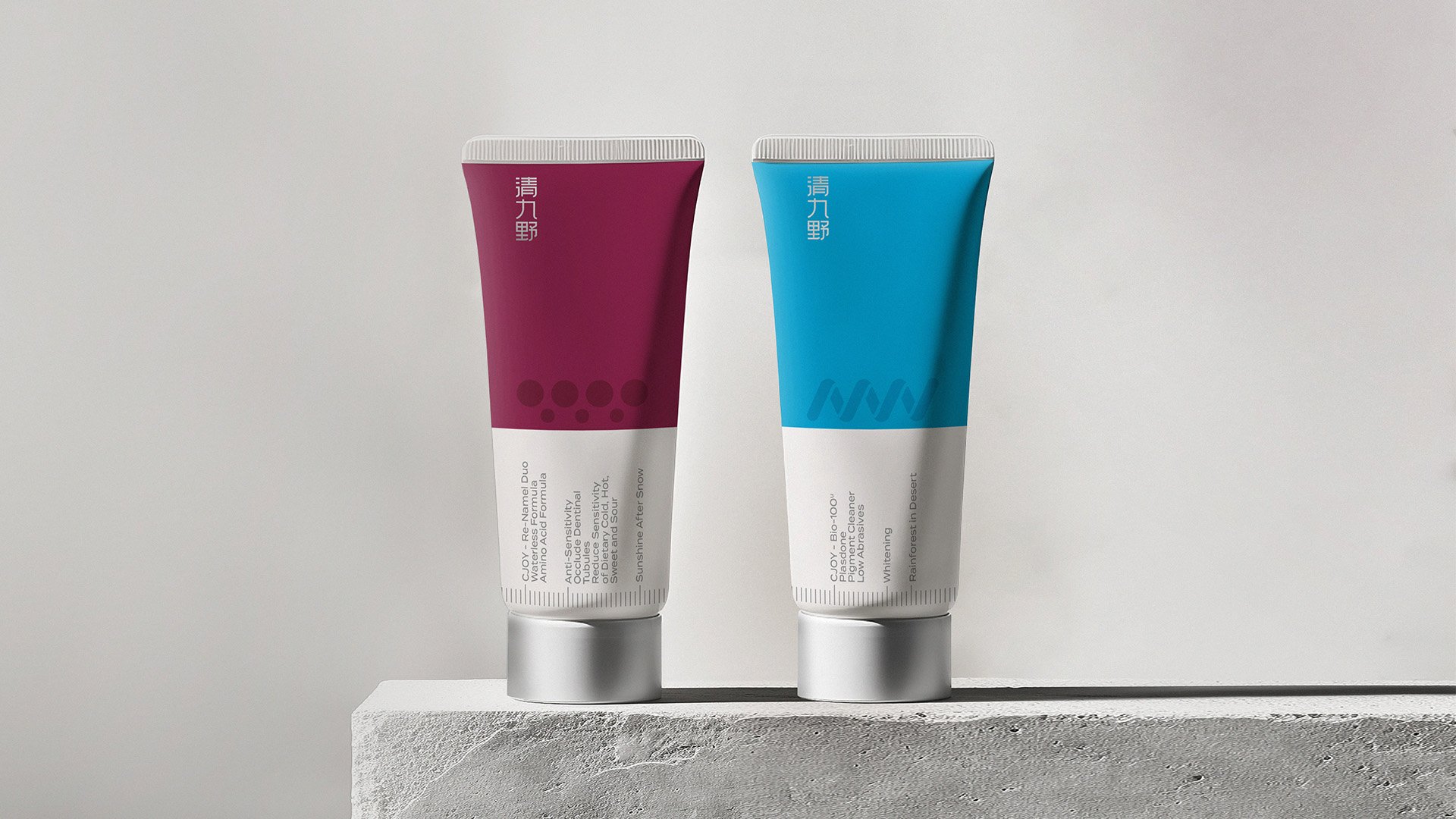
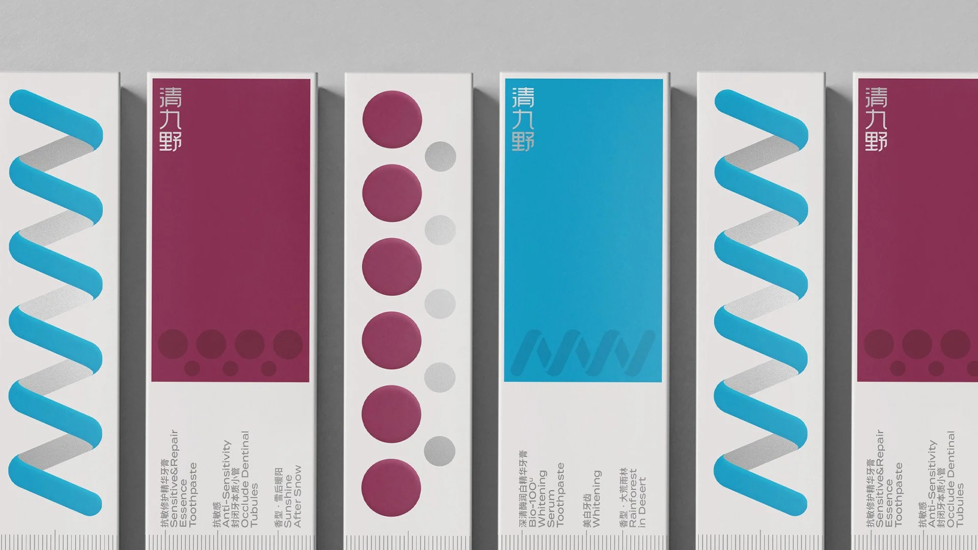
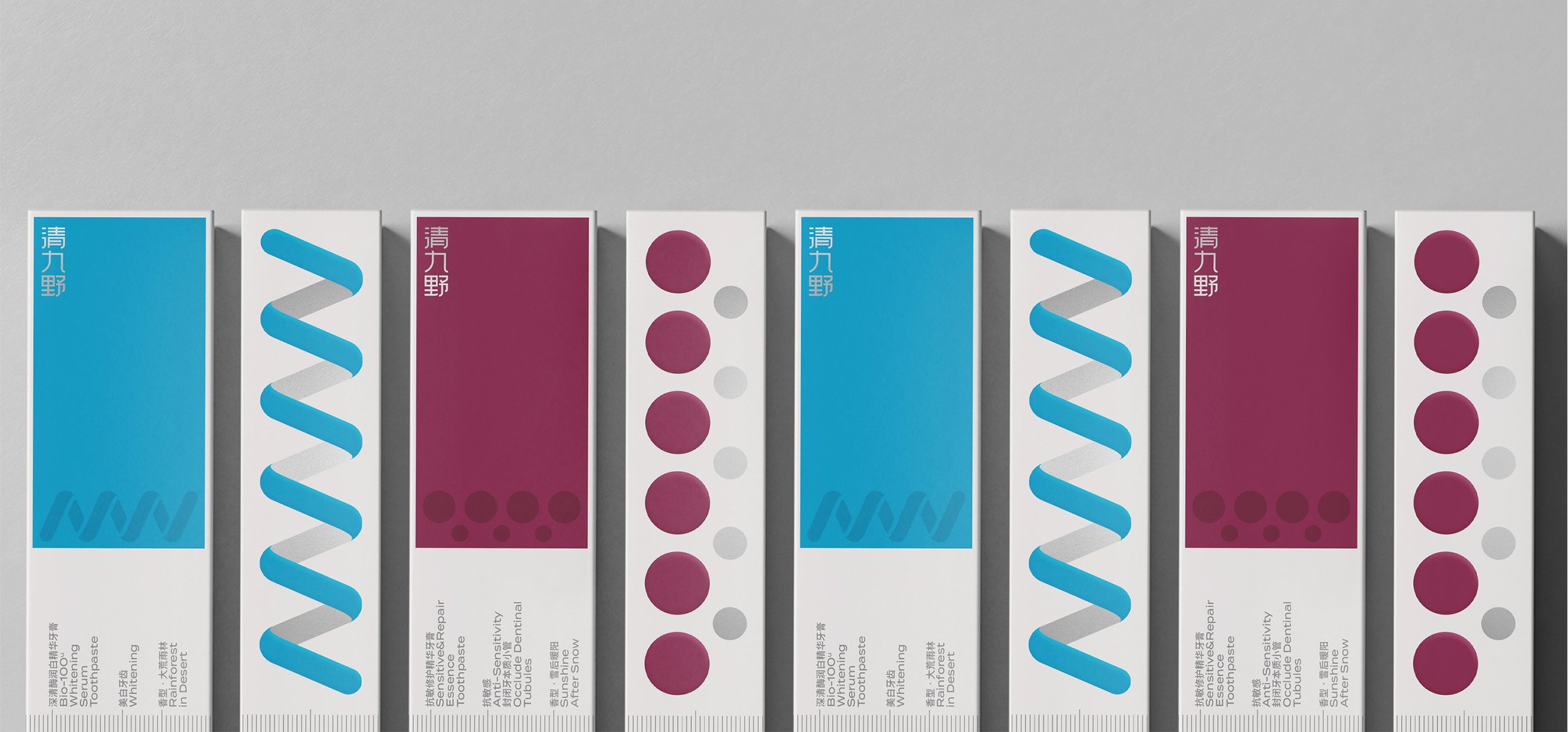
The brand logo is crafted with a refined, thin-lined sans serif typeface, designed to project professionalism, clarity, and lightness.
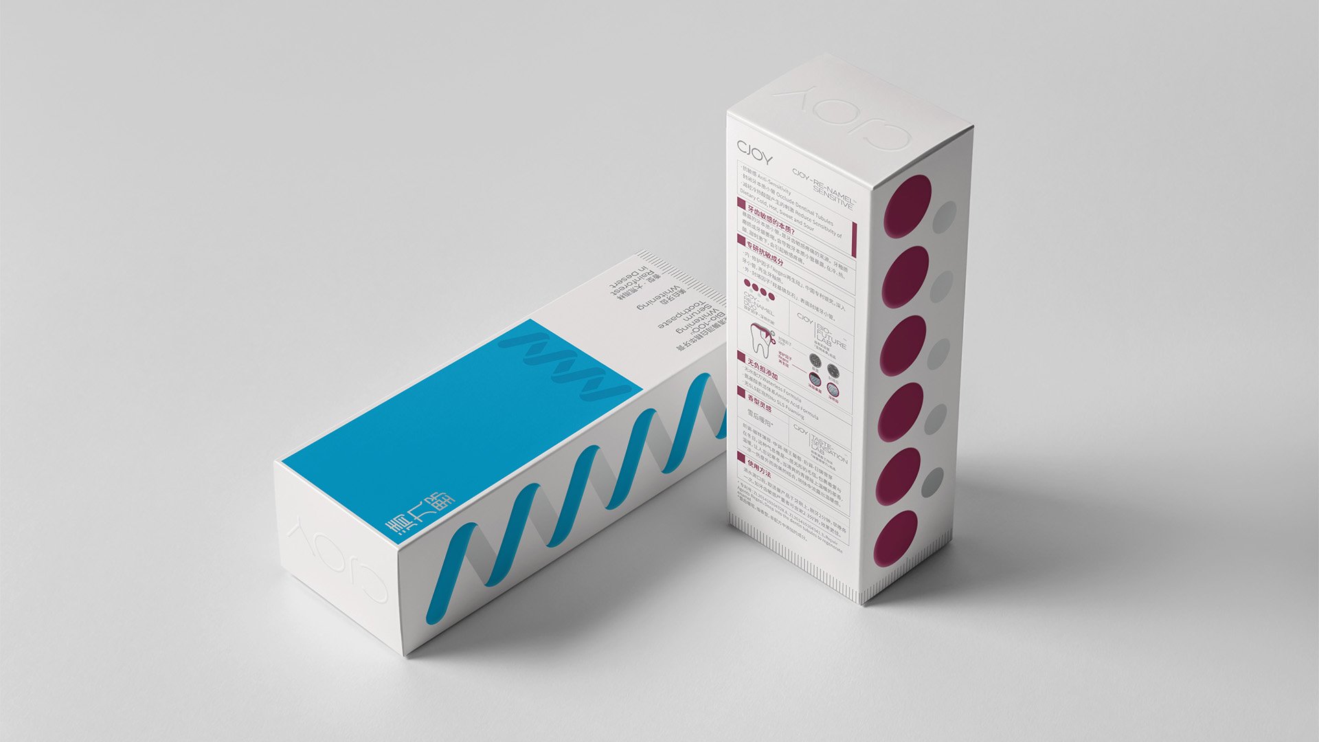
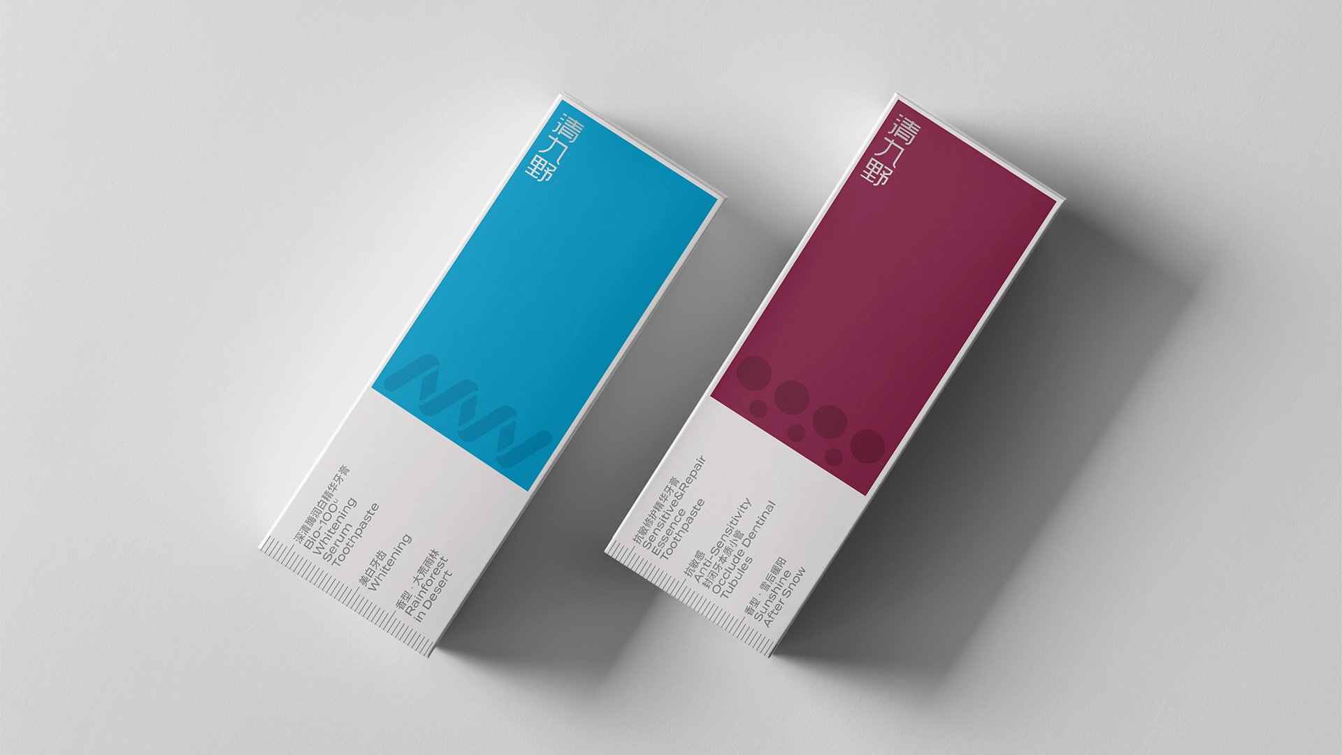
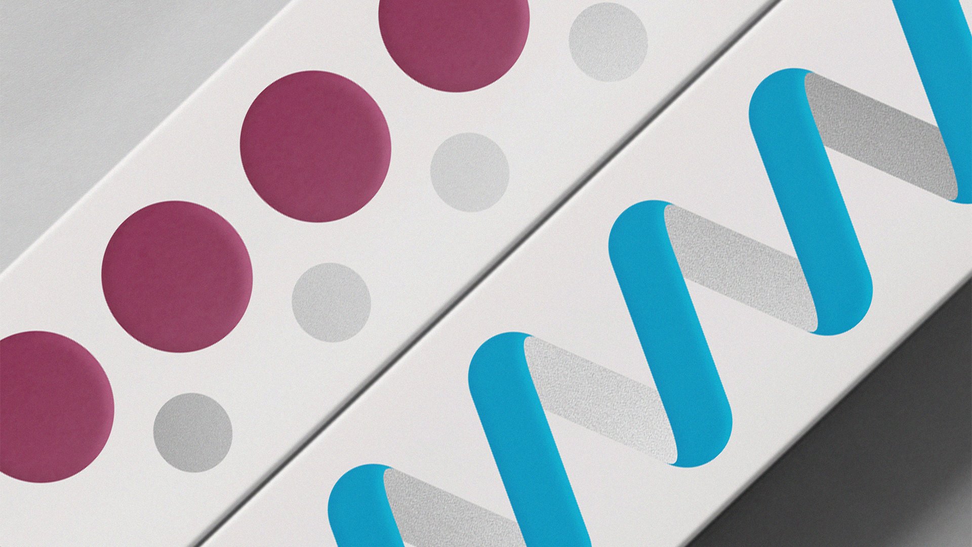
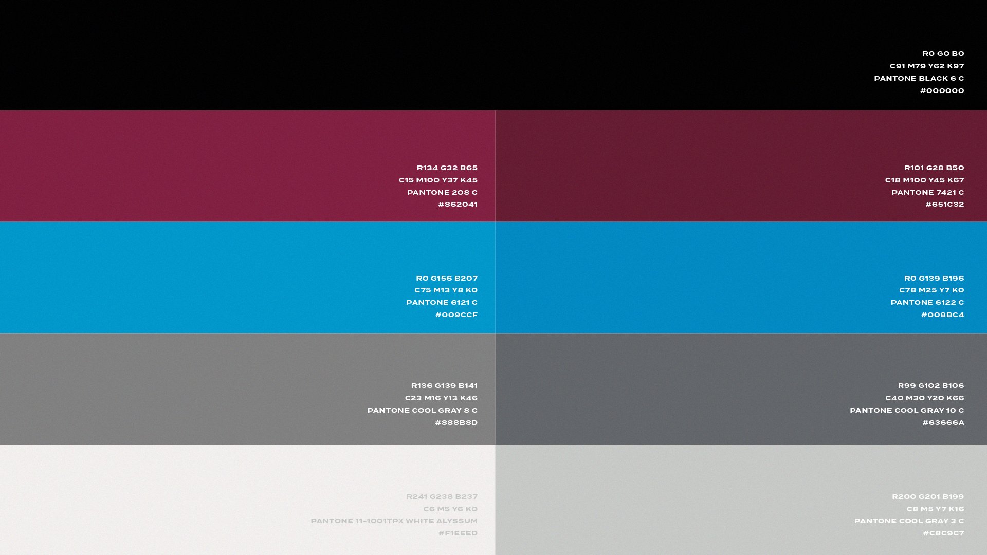
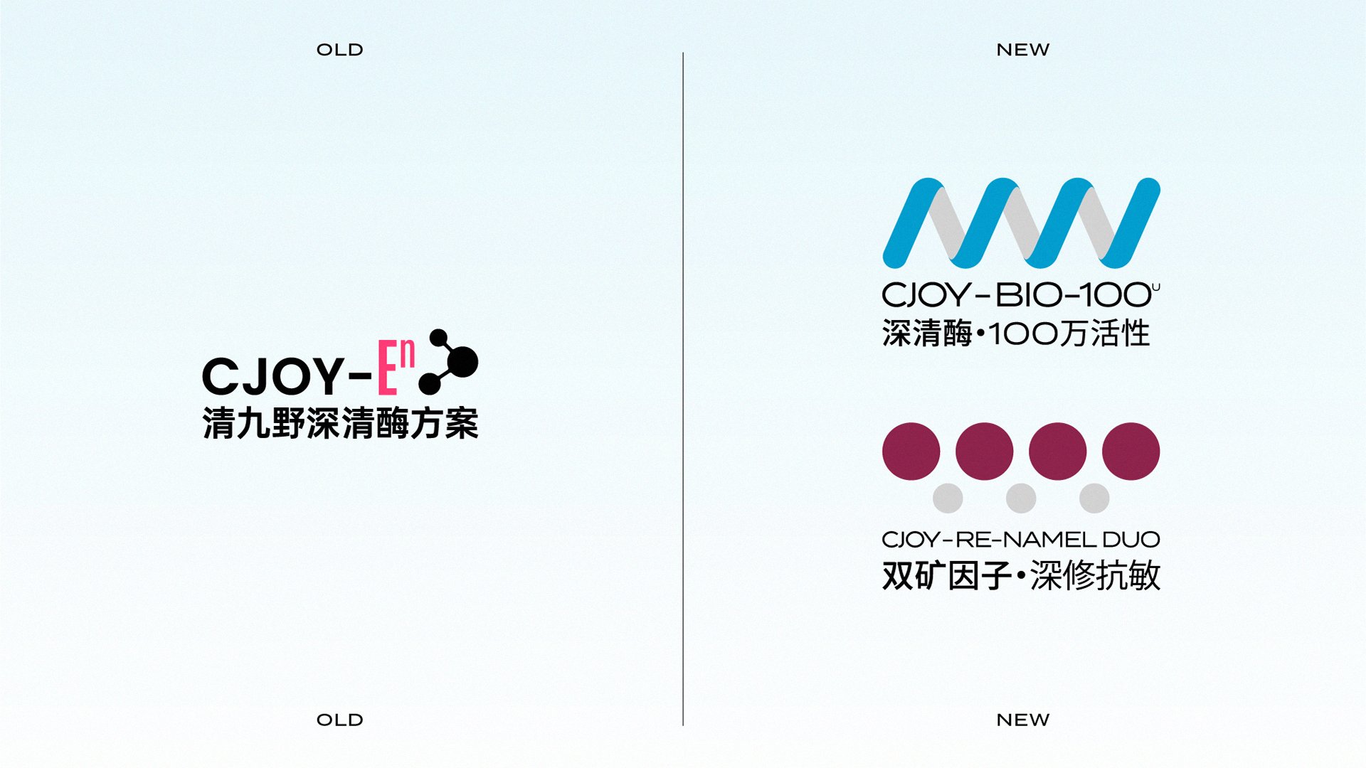
Packaging design reflects this duality of science and sensibility. A systematic grid inspired by measurement scales organizes information with clarity, underscoring the brand’s scientific rigor while establishing a distinctive visual identity in a crowded market. Complementing this, bold color blocks and abstract graphics symbolize the key biotech components of each product. These elements translate complex scientific concepts into sensory, visual forms—bridging rational biotechnology with an expressive, human touch. Unified yet flexible, the packaging maintains brand consistency while distinguishing product variations through color and form, reinforcing the brand’s core essence: half rationality, half sensibility.