Haulystic
BRANDING ( VISUAL IDENTITY, VISUAL SYSTEM, BRAND GUIDELINES, ART DIRECTION )
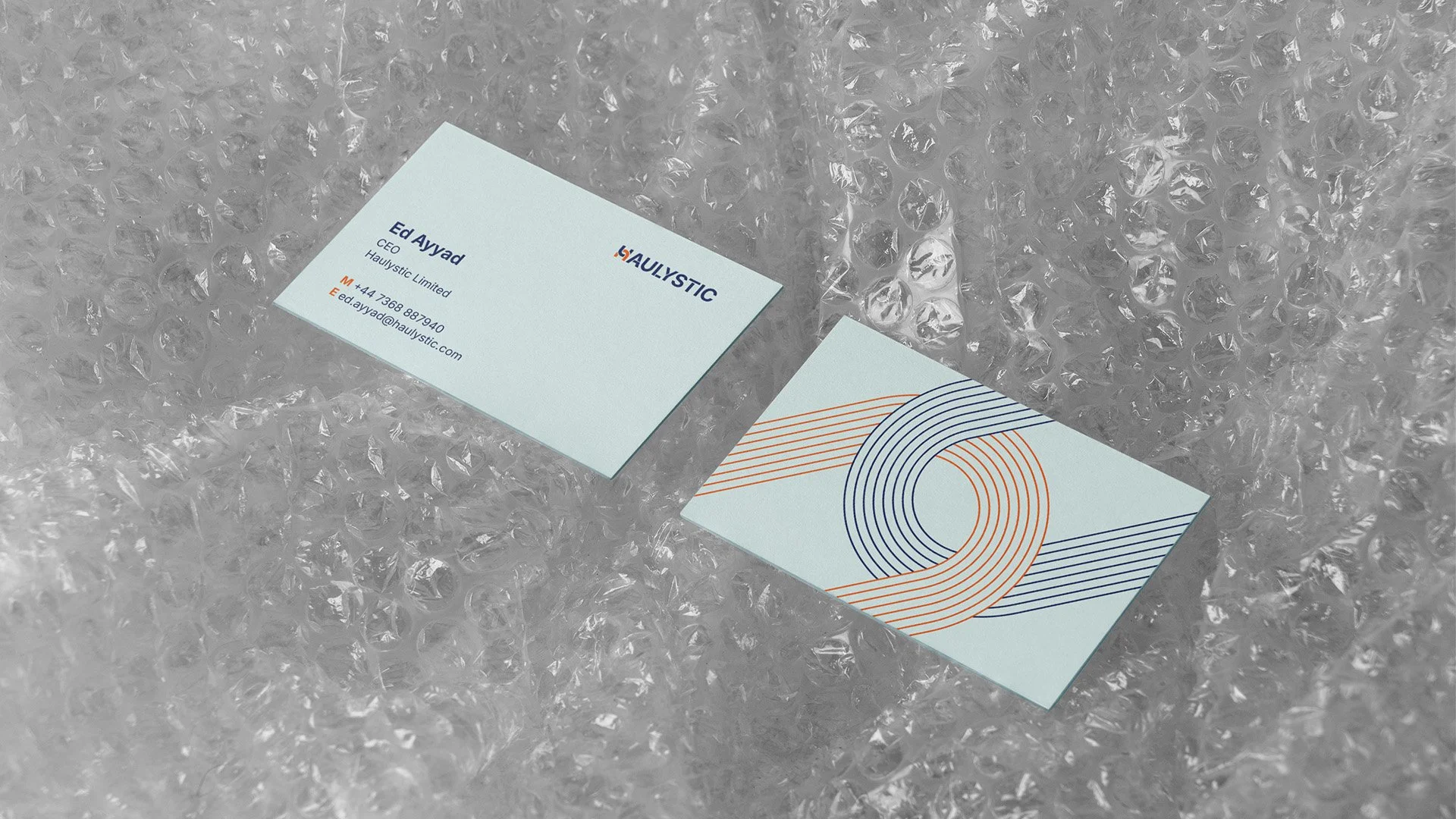
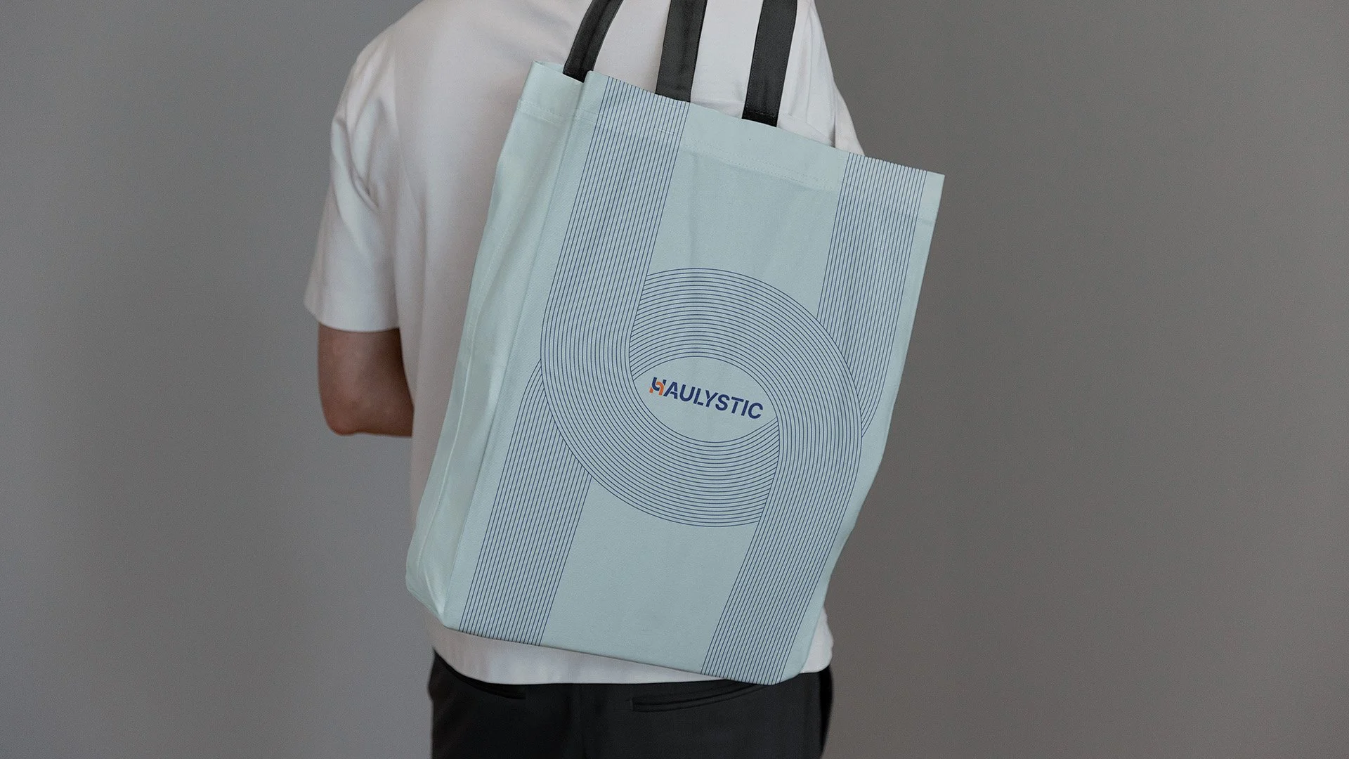
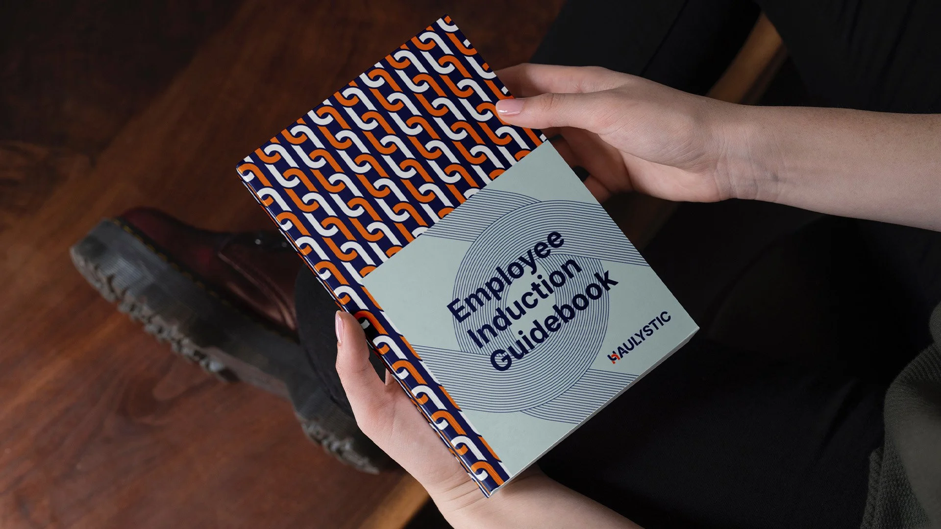
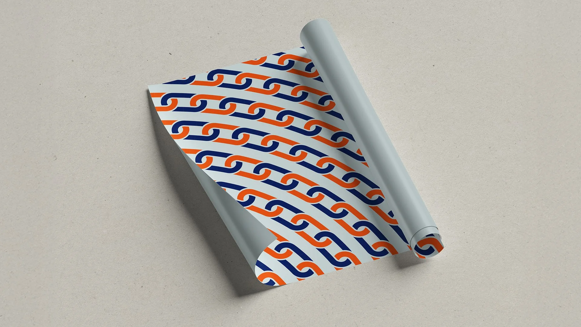
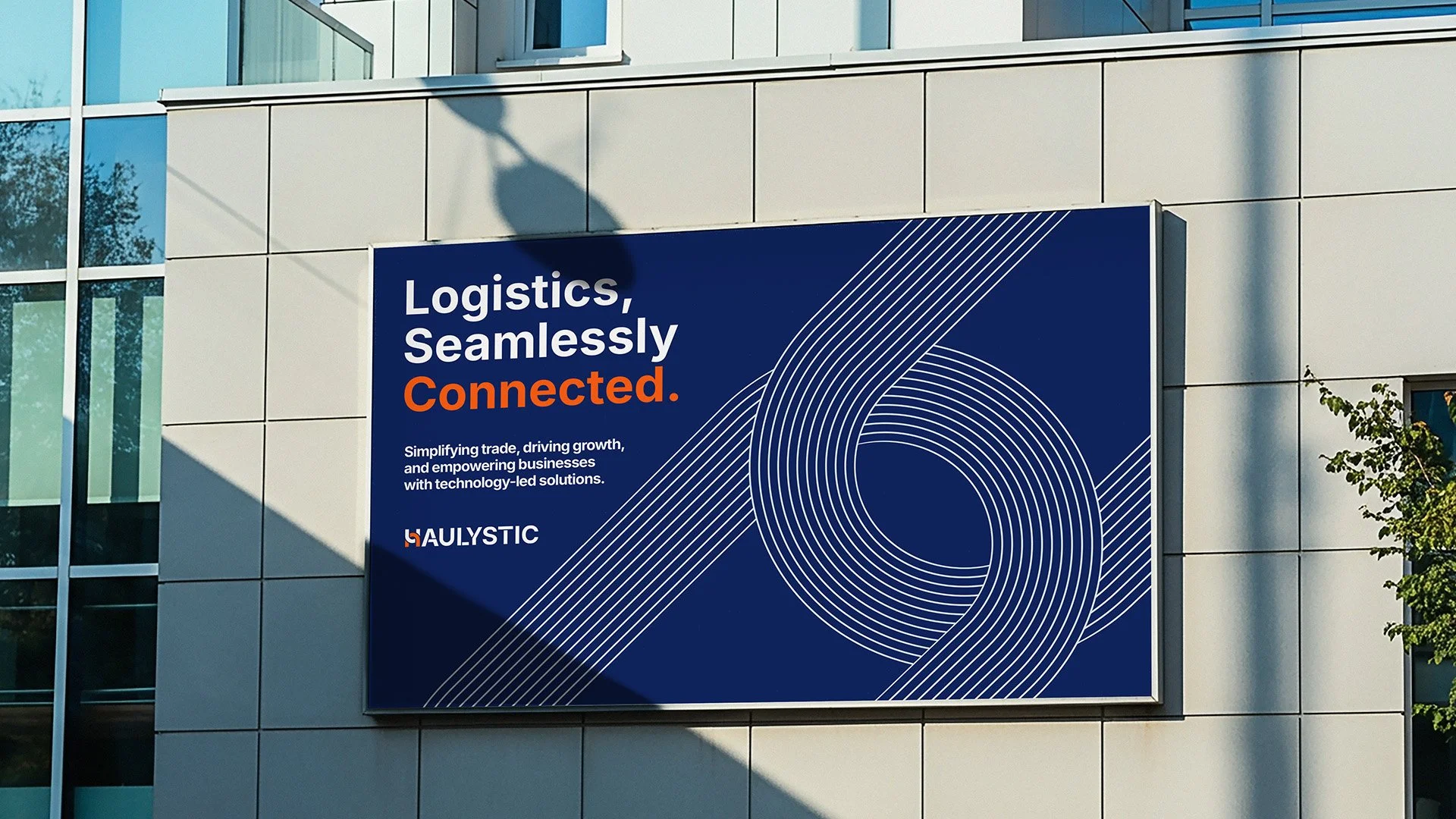
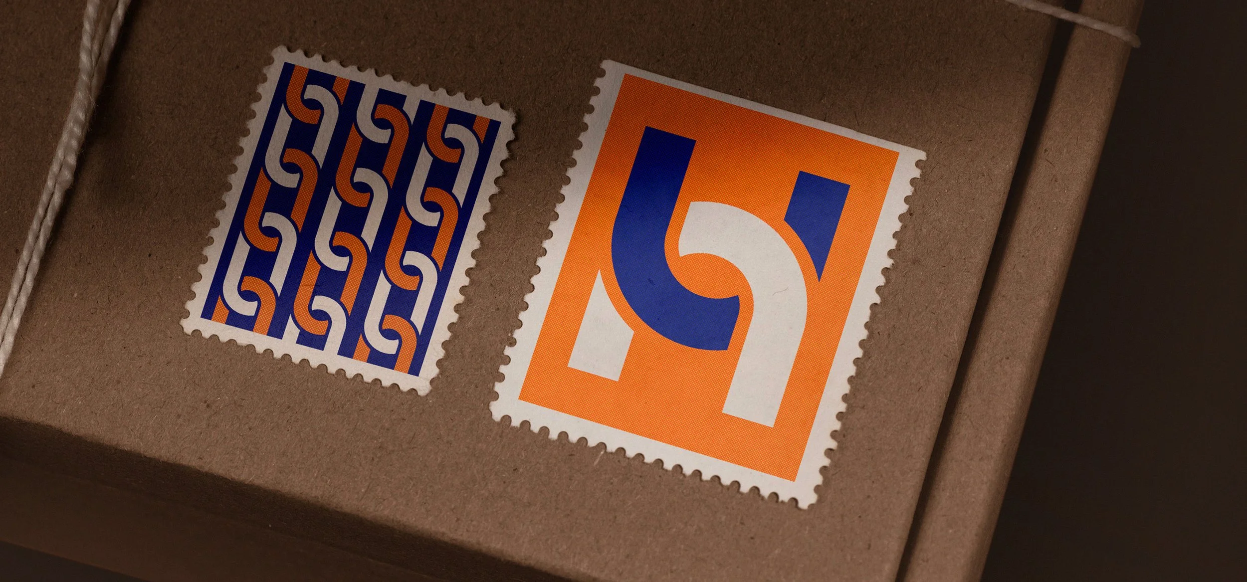
Haulystic’s brand identity is built around the idea of seamless connectivity. The interlocking orange and blue forms represent partnership, integration, and the unification of logistics and e-commerce. Orange expresses energy, flexibility, and innovation, while blue conveys trust, structure, and reliability. The interplay of curves and straight lines reflects adaptability within a stable framework, highlighting Haulystic’s holistic approach to solving complex challenges. The modern typography anchors the system, ensuring clarity and recognition while reinforcing the brand’s values of connection, efficiency, and progress.