Little Fierce
BRANDING ( VISUAL IDENTITY, VISUAL SYSTEM )
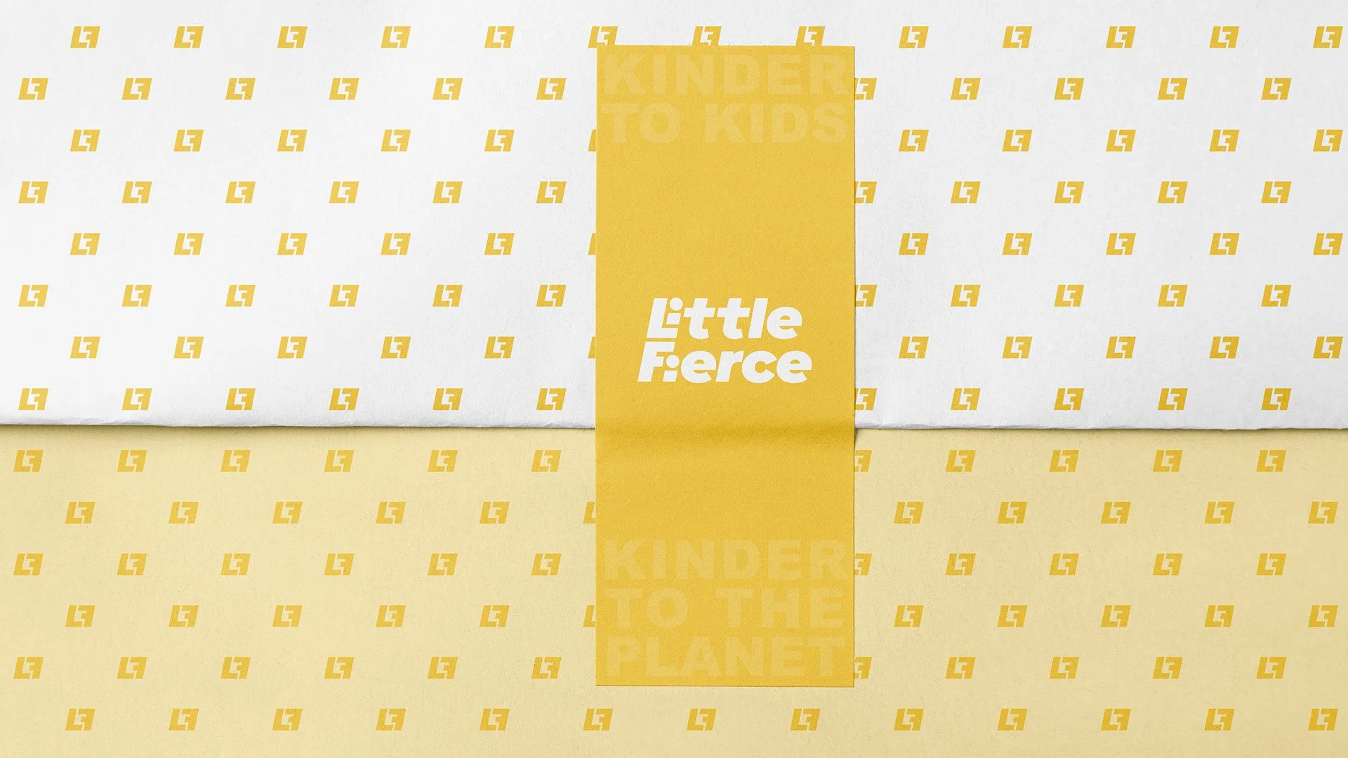
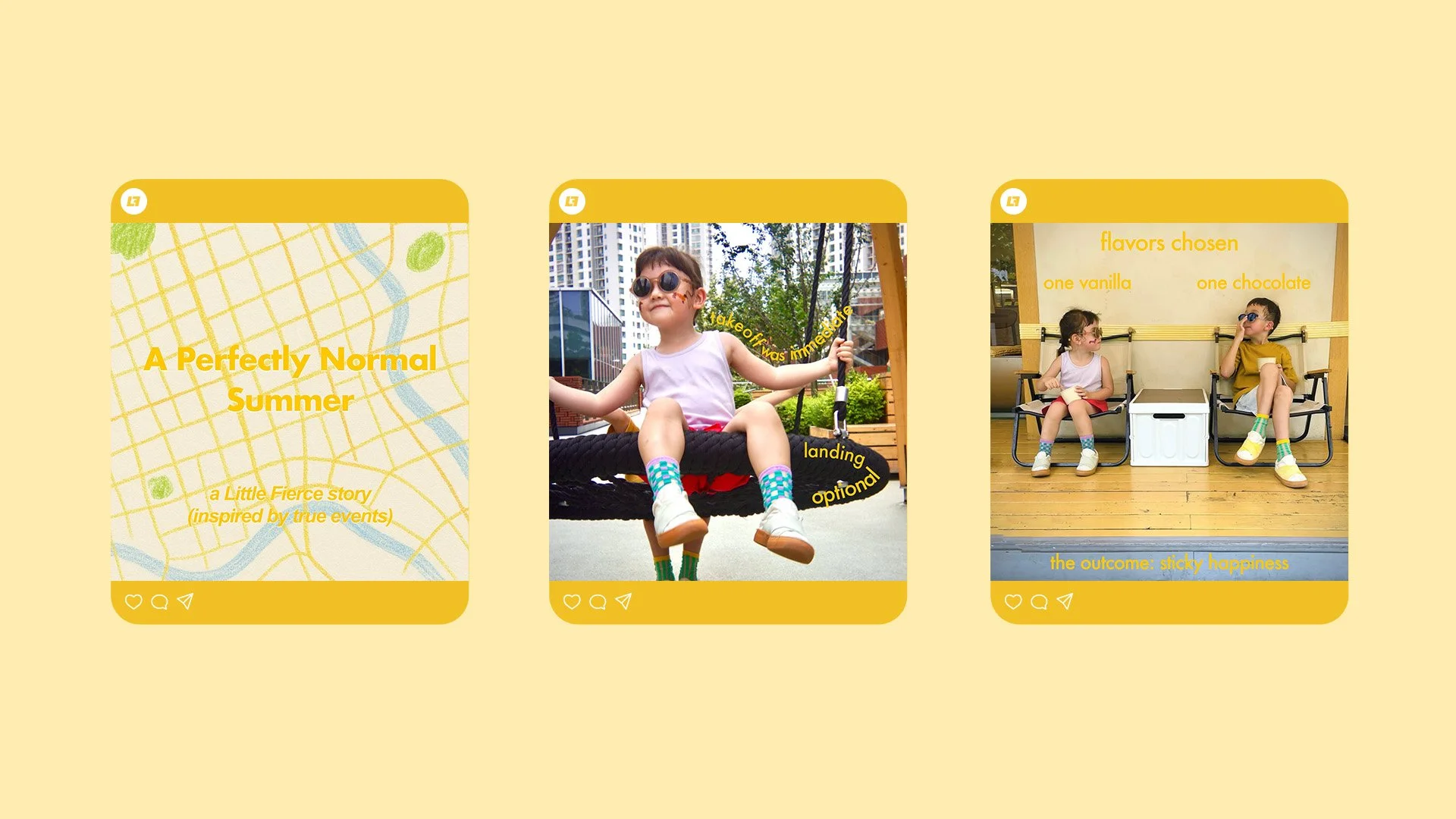
Little Fierce is a kid shoe brand built on the belief that products for children should nurture not only their comfort and style, but also the planet they will inherit. Guided by the slogan “Kinder to kids. Kinder to the planet.”, the brand combines playfulness with responsibility.
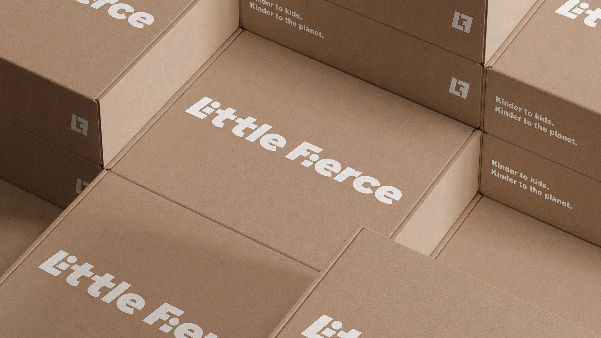
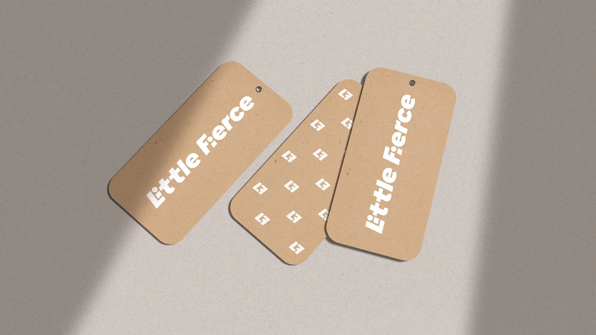
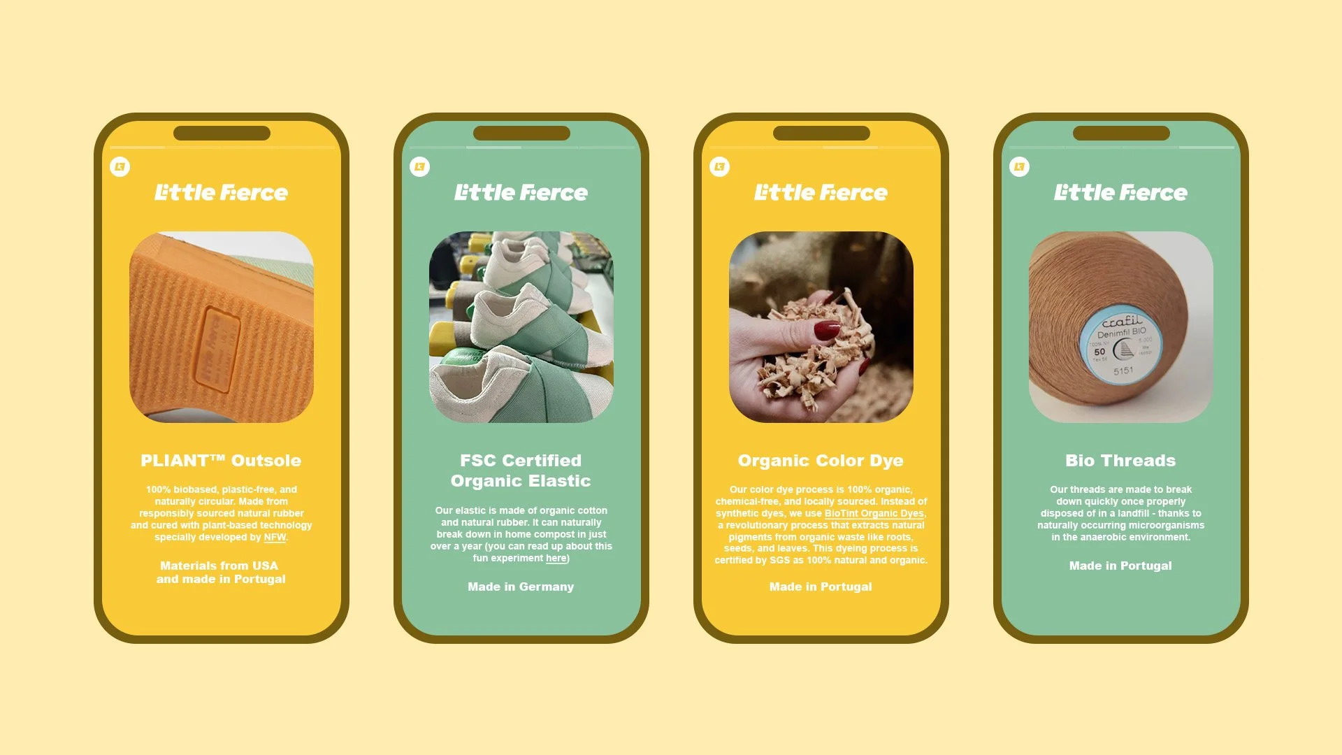
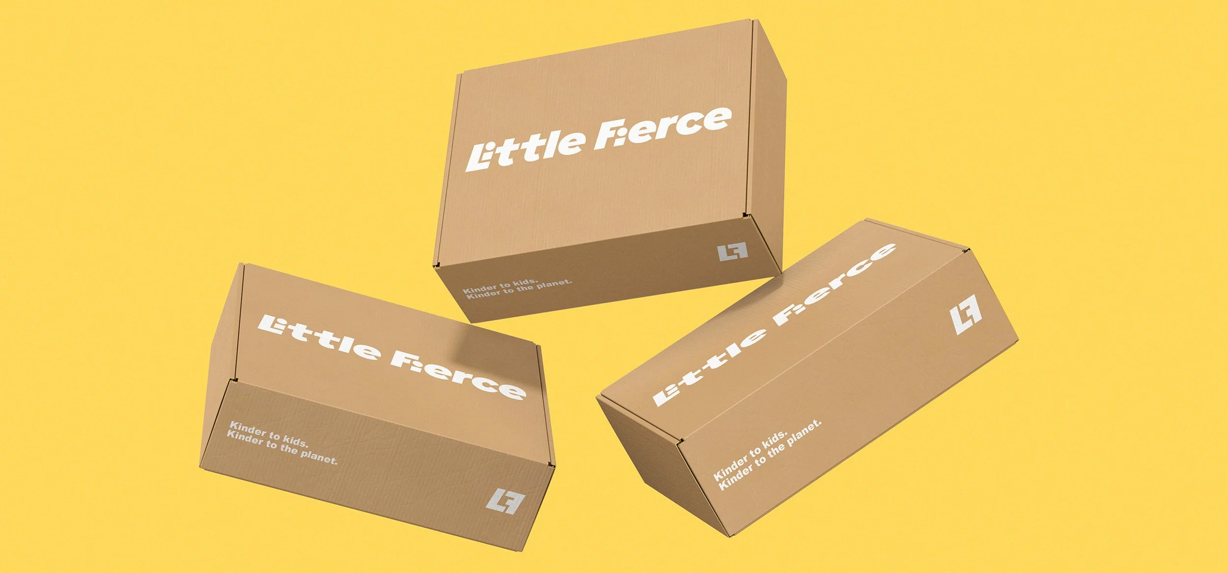
The identity embraces a bold yet approachable typographic logo, paired with natural textures and warm, eco-inspired tones. Kraft packaging, recycled tags, and simplified graphics reflect a commitment to sustainability while keeping the brand joyful and kid-friendly.
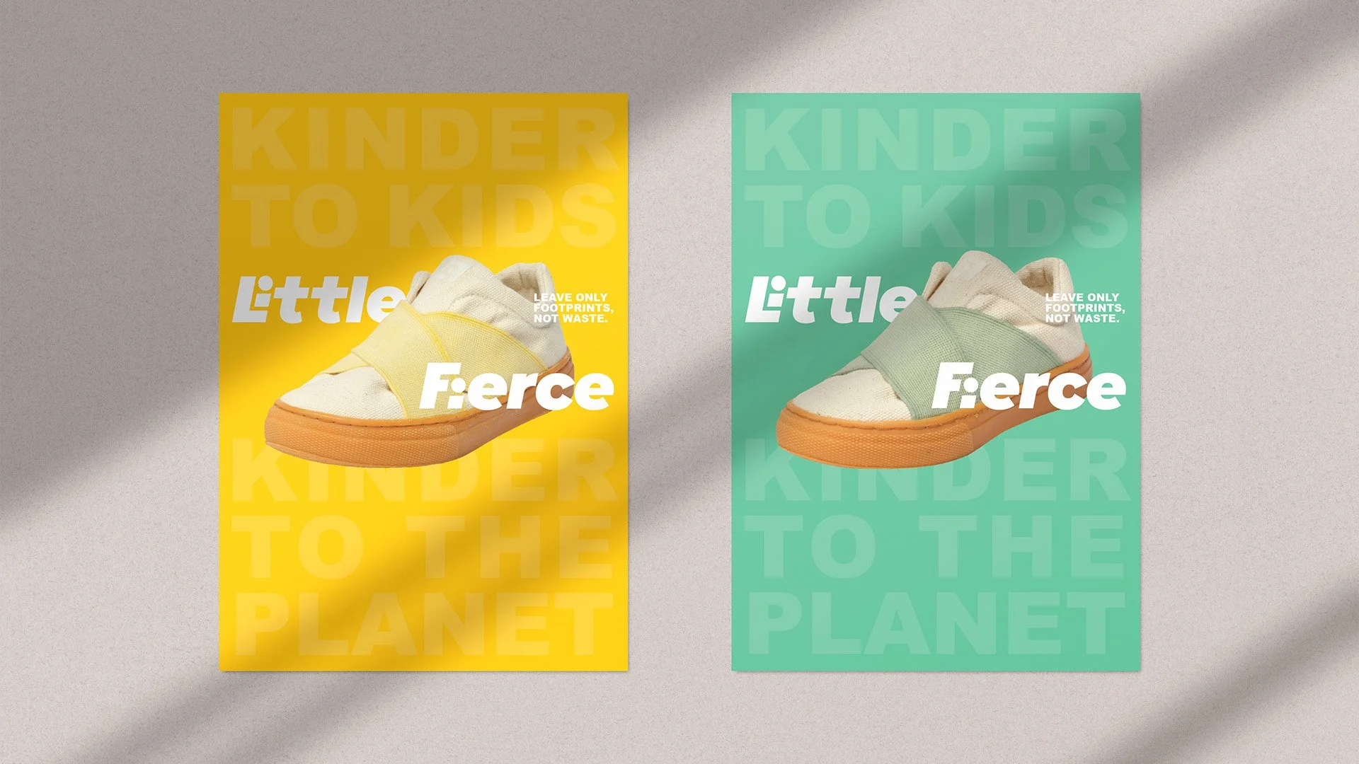
Visual messaging is driven by the hero line “Leave only footprints, not waste.”, highlighting the product’s end-of-life design: shoes are crafted with biodegradable and recyclable materials, ensuring nothing lingers as harmful “forever” waste.
From digital touchpoints to physical packaging, the brand system creates a consistent narrative of circular design. Little Fierce is positioned as a modern, conscious choice for parents—where sustainability meets style, and small steps become big impacts.